
Hello! This is Consultant K.
I usually handle manual creation and improvement projects for companies in the manufacturing and pharmaceutical industries. This time, I will share stories I've heard and tips I've learned in my daily work.
- Table of Contents
1. It is important for manuals to be "easy to read"

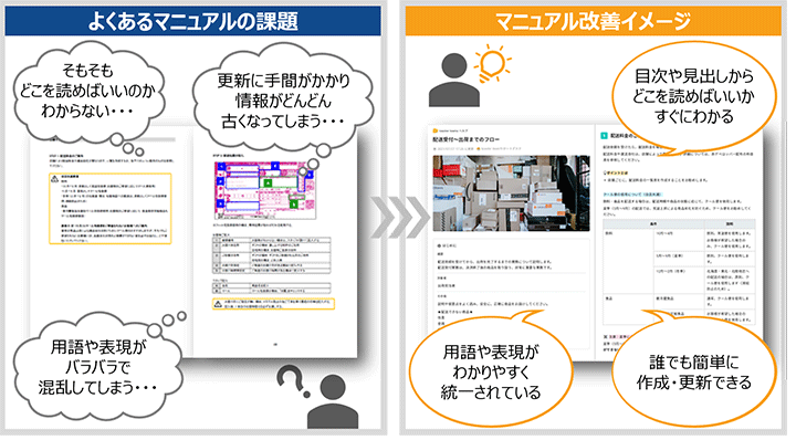
Have you ever been handed a manual by your boss or a senior colleague and thought, "I really don't feel like reading this manual..."? Manuals like that tend to be read less and less over time.
For companies struggling with the underutilization of their business manuals, when we look at the actual manuals, we often feel, "Hmm, this must be tough to read." Such manuals typically have the following tendencies.
・The text is densely written
・Sentences are excessively long
・There is no visual contrast
・Information is just haphazardly packed in
Conversely, simply being aware of this can lead to a much more readable manual. To encourage users to utilize the manual, it is important to create a clear manual that makes readers think, "I want to read this," "I can understand this," or "I will give this a try." I can almost hear someone saying, "I already know that!" but when it comes to actually writing a manual yourself, it can be surprisingly difficult.
For all of you, we will explain the key points for creating easy-to-read manuals.
3 Key Points for Creating Easy-to-Read Manuals

To create easy-to-read manuals that people want to read, the following three points are important.
① Improve the initial impression
② Write from the reader's perspective
③ Create headings
1. Improve the overall impression at first glance
A good visual impression can make the reader think, "This manual looks easy to read." Let's consider the following points.
・Add Contrast to the Layout
Make the title text larger and indent the body text to create contrast in the layout. For supplementary notes and warnings, decide on the icons and styles to be used, clearly distinguishing them from the main text. For example, when creating manuals in Word or PowerPoint, it is efficient to determine which styles to use for which information and include them in a template.
However, overusing icons or applying too many colors to the text can lead to an overload of information unrelated to the content, making it difficult to read. Be careful not to over-decorate.
・Create Margins
When text is densely packed, readers may first think, "This looks difficult to read." It's important to create appropriate margins on the page. By creating margins with the right balance, the organization of information becomes clearer, making it easier to reach the necessary information.
- Add Visual Elements
Using diagrams and images helps to facilitate visual understanding. For example, showing an actual image of a form along with examples of how to fill it out will allow for quicker comprehension than explaining it with text alone.
Additionally, presenting information in a tabular format organizes the items and explanations, making them easier to read.
② Write from the reader's perspective
Here are two points to keep in mind when writing from the reader's perspective.
・Make it concise
When long sentences continue, the reader may feel overwhelmed, thinking, "Do I really have to read this to the end...?" Aim to make your writing concise, keeping each sentence to about 40-50 characters for a smoother reading experience.
If explanations become lengthy, it is often because multiple ideas are crammed into one sentence. Review and check your writing, and consider breaking it into several sentences or using bullet points to divide the content. Additionally, texts with too many kanji can also give a difficult impression. A ratio of 3:7 for kanji to hiragana is a good guideline.
・Explain in words that resonate with the reader
To consider content and expressions from the reader's perspective, it is important to concretely imagine the profile of the manual's readers (such as their knowledge level, thinking, and feelings). It may be helpful to think of specific targets, such as new employees who are about to join or junior colleagues in their second year.
When writing a manual, it is easy to want to add a lot of information, thinking, "I want to supplement this" or "I want to explain that." However, if the reader is presented with information that exceeds their knowledge level, they will only become confused and understanding will not progress. Check whether the information is truly necessary for the target audience and ensure that you are not using overly complex expressions, and explain in words that resonate with the reader.
③ Create a heading
Establish headings to clearly define a set of information. Simply listing text makes it difficult to find the desired information.
Readers look for necessary information from the headings. Let's create headings that intuitively convey the content of the main text. For example, when explaining the procedure for heating using a machine, a heading like "Heating" is not as effective as "To Heat." The term "Heating" alone does not clarify whether it explains the mechanism of heating or the method of heating.
Does your manual meet the following points ① to ③?
If you feel there are areas that are lacking, please try to improve those points. You should be able to enhance it into a visually appealing manual that makes readers want to "read it."
If you would like to learn more about manuals that make readers want to "read them," please refer to the blog below.
[Related Articles]
[Introduction to Manual Creation] What is the Design of an Easy-to-Understand Manual?
The Importance of Formatting in Manual Production - From the Perspectives of Readers and Writers
●Case Study: Denso Corporation
At Denso Corporation, we worked on creating even clearer manuals to ensure that a wide range of users can immediately use the regional information distribution system we provide. In particular, aiming for a "user-friendly manual for the elderly," we revised the content to make it more visually accessible. As a result of adopting a simple design and concrete expressions, we were able to reduce inquiries regarding basic operations.
Denso Corporation Case Study


 Business Manual
 Operation Manual
 Manual creation
 Director, Writer
 In-house Support
 Video
Video Manual
 Manual Creation
 One-Stop Service for Manual Creation
 Manuals and Documents
 Improving Manual UX through UX Writing
 Knowledge Management
 Jamstack
 GitHub/Markdown