

Hello! I am Consultant S.
I usually handle manual creation and improvement projects for companies in the manufacturing and insurance industries. This time, I will focus on "formatting," which is one of the key points that affect manual quality.
Manuals are important tools for clearly conveying how to use products and services, as well as how to operate business processes. Therefore, the impression and usability of the manual can impact the accurate information delivery, which is the purpose of the manual.
Here, I will explain the importance of formatting in manuals, using examples of manuals I have encountered, and provide tips on how to create the "optimal manual" that makes readers want to read it, divided into sections.
- Table of Contents

1. Formatting that Influences the Impression of the Manual

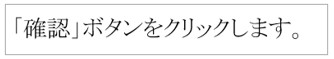
Suddenly, please take a look at the two manual examples below. Which manual do you feel is easier to read at first glance?
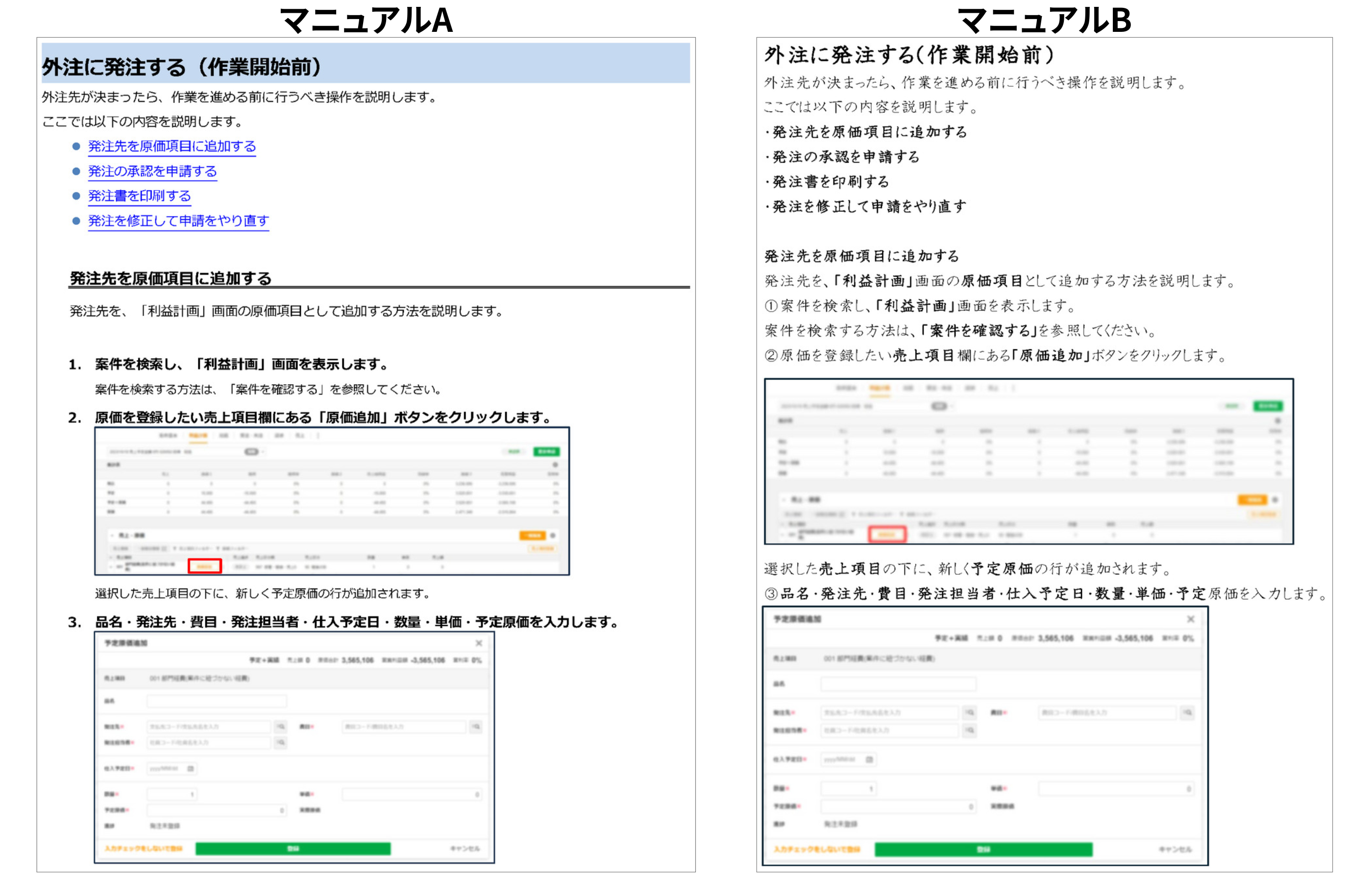
Perhaps many people feel that "Manual A" is easier to read. The two manuals mentioned above are actually identical word for word. The only differences are in formatting such as font, text size, and line spacing. Just the difference in formatting can significantly change the impression.
"Manual B" has the following specific issues.
| ・Brush-style font is used ・Font size is uniform ・Line spacing is narrow ・Text color is hard to see ・There is a lot of information in the same paragraph ・Indentation position is the same for all |
・Cannot quickly find the information you want ・It's hard to understand which information is for what purpose ・There is a possibility of overlooking information ・If the amount of information increases, there is a possibility of getting lost |
Depending on the font used, it may give an outdated or childish impression. Additionally, if the size or color of the text is inappropriate, it can become stressful to read, resulting in a manual that is not read at all.
It is a great waste if the content is correct, but it is not read due to a bad first impression.
Formatting not only affects the first impression of the manual but also has a significant impact on usability. By choosing the appropriate format, efficient information delivery to the reader can ultimately be achieved.
For example, if the choice of font, line spacing, and paragraph arrangement are well-organized, the manual will be easy to read and understand. Conversely, if the formatting is not used properly or is disorganized, it can confuse the reader and potentially undermine the overall reliability of the manual. So, what aspects should be considered when setting the format to create a manual that has a good first impression and is user-friendly for the reader?

2. What is the appropriate format in manuals? (From the reader's perspective)

When it comes to the "format" of a manual, many may think that it requires a certain "sense" because it affects the appearance of the manual. Indeed, there may be aspects that require some aesthetic sense, such as a "cool" font, "stylish" color schemes, and "sophisticated" designs. However, the most important thing in determining the format of a manual is to capture and organize information structurally.
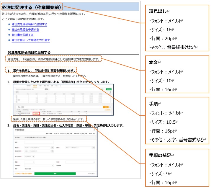
So, what does it mean to capture information structurally? Let's consider the earlier example of "Manual B."
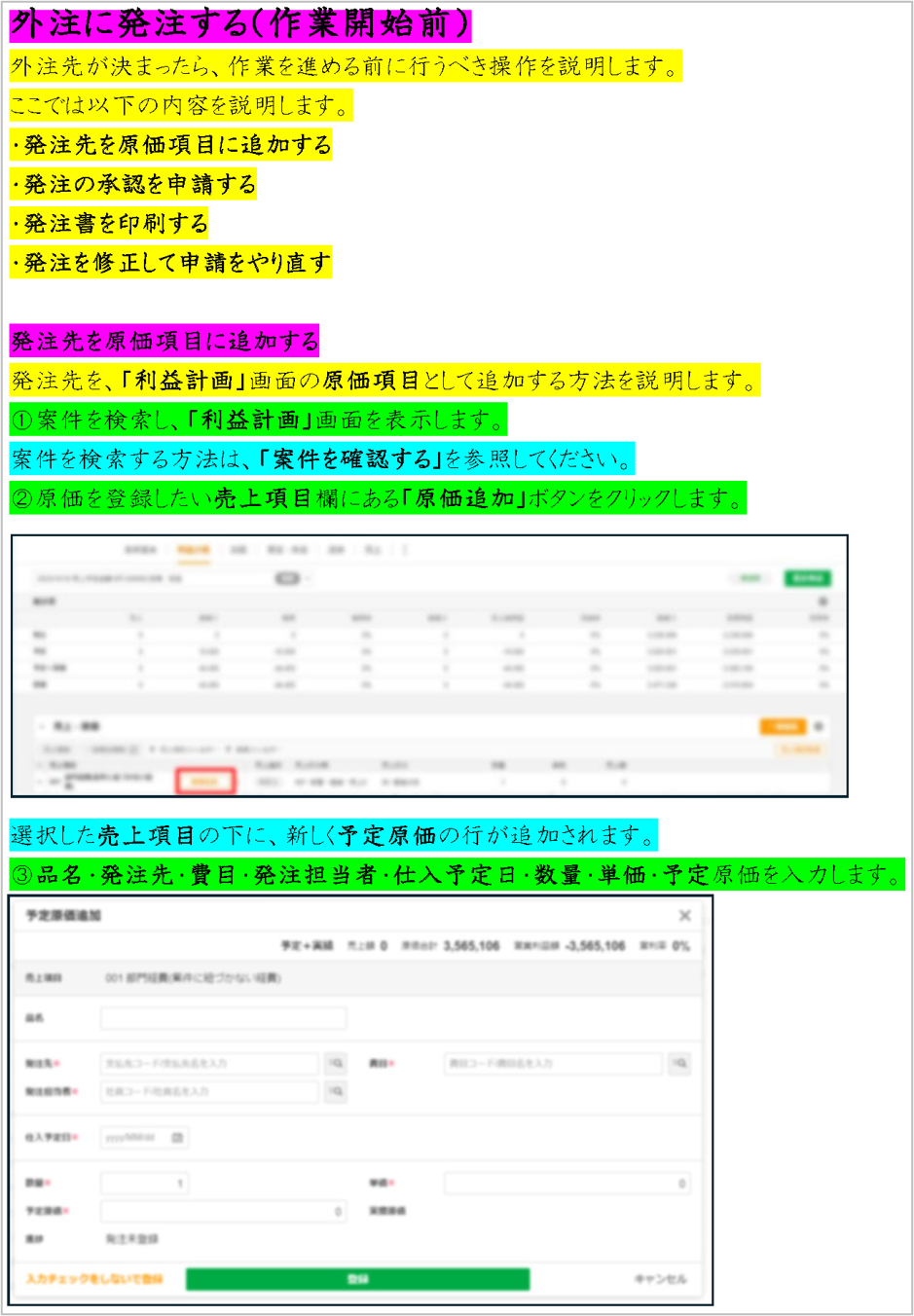
The above is a color-coded version of the text from "Manual B," focusing on the differences in the types of information. Specifically, the colors are divided as follows:
・Pink: Heading
・Yellow: Overview
・Green: Procedure
・Light Blue: Supplement to Procedure
When setting the format of a manual, it is not a matter of freely decorating it according to personal preference. It is necessary to identify the "parts" that appear in your company's manual, and to provide a "default presentation" for each of these parts.
Now, let me explain the key points for setting that presentation.
Font
Fonts are one of the key points that greatly influence the first impression of a manual. It is necessary to choose an appropriate font according to the purpose and content of the manual, as well as the knowledge level of the reader.
Below are examples of fonts commonly used in Japanese manuals and their characteristics.
| Gothic font: |
 Widely used in manuals, advertisements, and posters. In large headings and titles, it can also be used as a font that expresses strength and individuality. |
|---|---|
| Meiryo: |
 Additionally, the line thickness is uniform, making it easy to read, and the spacing between characters is wide, which is another characteristic that enhances readability. Generally, it is often used in business documents, reports, and presentation materials. |
| Mincho Font: |
 It has high readability and is suitable for long sentences. The standard font for newspapers and novels is Mincho. Additionally, it conveys a sense of formality, so it is often used in manuals related to employment regulations and security. |
An important factor in deciding on a font is whether it aligns with the purpose of the manual, the audience, and the content.
For example, using a Mincho font for beginner operation manuals or business manuals for new employees can create a difficult and unapproachable impression. Conversely, using Meiryo for specialized technical manuals may give an impression of being amateurish.
Additionally, it is generally best to unify the font to one type throughout the entire manual. If you differentiate too much, such as using Gothic for headings, Meiryo for procedures, and another font for notes, it can result in a manual that lacks a sense of unity and consistency.
Font size, line spacing
If the text is too small, readers may struggle to understand the content. This is especially important for manuals that contain long texts or are expected to be displayed on small screens like smartphones. Additionally, if the line spacing is too narrow, the manual may appear cramped overall. Conversely, if the line spacing is too wide, it can give a stretched impression, so care should be taken.
The typical font size used in the main text of manuals is around 8 to 12 points. The line spacing is approximately 1.0 to 1.5 times. However, depending on the type and purpose of the manual, larger font sizes or wider line spacing may be necessary. For example, manuals that explain product handling or setup may benefit from a larger font size. On the other hand, manuals that need to pack in a lot of information, such as instructions for drugs or medical devices, may require smaller font sizes or narrower line spacing to reduce the number of pages and keep the content compact.
It is recommended to set the font size for each "part" that appears in the manual. By using a slightly larger font size for headings or steps that you want to highlight, it becomes easier for readers to quickly find the information they are looking for.
Text Color
In manuals, it is generally advisable to use black or dark gray text. Using hard-to-read text colors can cause significant stress when reading the manual. Additionally, while it may be tempting to use various colors to emphasize certain phrases, overdoing it can hinder the reader's understanding.
For parts that you want to highlight, such as notes, it is better to keep the text color consistent and instead adjust the font size or use bold text for emphasis. This is especially important for manuals that will be printed in black and white, as differences in text color may not be visible when printed. There are also other ways to make information stand out, such as using icons to indicate 'caution' or 'supplement', or enclosing notes and supplementary information in boxes, rather than just changing the text color.
So far, we have explained the formatting of the manual in terms of "font," "font size and line spacing," and "color."
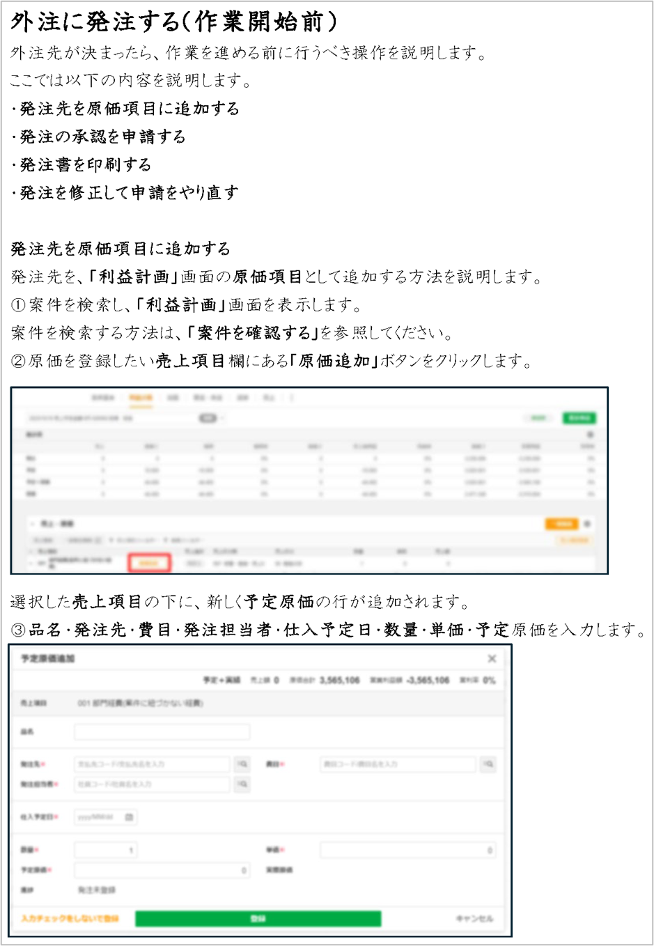
In the previously introduced "Manual A," how was it actually formatted?
The above describes the formats set for the types of information in "Manual A."
"Manual A" was designed in such a way that it structurally captures the types of information, with formats designed for each part. This is why it gives a readable impression. It is not just a matter of taste or preference; it is clear that we need to carefully distinguish between different types of information and consider formatting that has a clear distinction.
Additionally, the elements shown above, such as "font," "size," and "line spacing," are examples of factors that determine formatting. Other elements, such as indentation and bullet point settings, should also be configured as needed.
3. What is the appropriate format in manuals? (From the writer's perspective)

So far, we have explained the format of manuals from the perspective of usability for the reader. Additionally, an important factor is the creation burden for the writer.
Let's take another look at 'Manual B'.
Overall, the manual lacked clarity, but to enhance the reader's searchability, certain sections are highlighted with bold formatting. However, this overly detailed formatting can actually be a pitfall. It overlooks the perspective of the writer's efficiency in creating the content.
For example, the button names within the steps are in bold. Additionally, terms that are keywords in the steps are also bolded.
By deciding on formatting at the word level within the text, the editing burden significantly increases. This is especially true for manuals that are frequently updated, as the formatting burden accumulates with each revision. Furthermore, if the person in charge changes, it may become difficult to create content in the same manner following complex rules.
When setting the formatting for a manual, it is necessary to consider rules that do not impose excessive burdens during revisions and standards that allow for writing at the same level of detail even if the writing personnel changes. In the above example, when wanting to emphasize a word in the text, it is preferable to establish a rule such as enclosing it in parentheses rather than using bold. Formatting should be set at the sentence level, and it is best to avoid making detailed formatting decisions at the word level within the text.
4. Summary
This time, we focused on the format of manuals and introduced perspectives from both the reader and the writer. How did you find it? It should be clear that using the appropriate format in manuals is important for both the reader and the writer.
First, from the reader's perspective, it enhances the searchability of information and helps quickly find the necessary information. This reduces visual burden, promotes stress-free information retrieval and understanding of content, and is expected to improve work efficiency.
On the other hand, from the writer's perspective, it is possible to maintain consistency throughout the manual and streamline the editing process. This not only reduces the risk of misunderstandings and misinformation but also enables smooth collaboration even when multiple parties are involved, as they share the same rules and standards, ultimately leading to improved quality.
Let's aim for manuals that are easy to understand and edit, considering the perspectives of both the reader and the writer.
As mentioned above, the format of the manual is not a matter of "sense"! Please cultivate the skill to capture the differences in types of information. Also, when creating manuals in the future, please refer to this article. Additionally, there are various points and tips for creating the "optimal manual" beyond just the "format." Please refer to the related articles below.
>Three Approaches Necessary for Manual Creation
>Tips from Professionals on Creating and Establishing Business Manuals
If you are thinking, "Even so, I don't have time to create manuals" or "There is too much information, and I don't know where to start," we recommend hiring a professional. Human Science has a proven track record of creating numerous manuals since 1985. We are truly a group of professionals in manual creation. We can consistently support you from organizing current issues to formulating improvement policies and creating customized manuals. If you have any difficulties in creating business manuals, please feel free to consult us.
>Business Manual Creation Service PageFeature 1: Extensive Manual Production Experience with Large and Global Companies
Human Science has a track record of producing manuals for 267 companies and 3732 projects, primarily in the manufacturing and IT industries. We have worked with renowned clients such as Docomo Technology Inc., Yahoo Inc., and Yamaha Corporation.
>Manual Production Case Studies
Feature ②: Research and Analysis by Experienced Consultants - Output
The creation of business manuals is handled by our experienced consultants at Human Science. Skilled consultants will propose clearer business manuals based on their extensive experience and the provided materials. Additionally, manual creation is possible even from the stage where no materials are available. The assigned consultant will conduct interviews and create the manuals.
> Manual Evaluation, Analysis, and Improvement Proposal Services
Feature ③: Not only creating manuals, but also providing support for implementation
Human Science is responsible for the important phase of "implementation" after manual creation. For example, even after the manual is created, we will conduct updates and hold manual creation seminars. By implementing various measures, we approach the goal of ensuring that the manuals are established in the field.
Thank you for reading until the end. I hope this blog serves as a helpful hint for manual creation.


 Business Manual
 Operation Manual
 Manual creation
 Director, Writer
 In-house Support
 Video
Video Manual
 Manual Creation
 One-Stop Service for Manual Creation
 Manuals and Documents
 Improving Manual UX through UX Writing
 Knowledge Management
 Jamstack
 GitHub/Markdown