


Paragraph styles bring consistency and efficiency to typesetting, so we have naturally proceeded on the assumption that they are used. However, we occasionally encounter submitted data that shakes this premise. No use of paragraph styles, typeset using only character styles, styles ruined by excessive overrides, a mixed jumble of styles originating from multiple sources... This has no positive impact on quality, cost, or delivery time.
A video explaining the fundamentals—what characters are, what paragraphs are, what paragraph styles are, how to differentiate them from character styles, and why these functions are important and indispensable—is now available in an easy-to-understand manner. Regardless of whether you use InDesign or not, we recommend that anyone involved in document production watch it as part of their general knowledge.
[InDesign 25th Anniversary Event] What Are Paragraph Styles and Character Styles?|Official Adobe
- Table of Contents
Paragraph Rules|Paragraph Rules
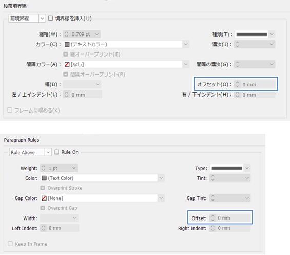
This function inserts rules before or after a paragraph. The boundary line is drawn below the virtual body in the Japanese composer, and on the baseline in the Western and multilingual composers. Increasing the value of "Offset" moves the front boundary line upward and the rear boundary line downward. Checking "Keep In Frame" prevents the boundary line from extending beyond the text frame.
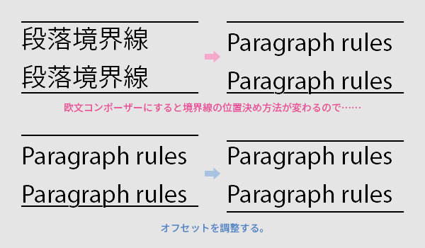
When creating the English version based on the Japanese version, it is necessary to adjust the offsets because the mechanism for positioning characters and rules changes with the change of the composer. Additionally, unlike Japanese characters that fit within the virtual body, Latin alphabets have descenders (the lower ends of characters) that extend below, so it is also necessary to consider preventing the rules from colliding with the characters.
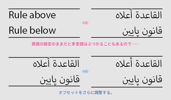
Some languages have characters with larger descenders or ascenders (top of the character) than English, which may require further adjustments.
Paragraph Border|Paragraph Border/Paragraph Shading|Paragraph Shading
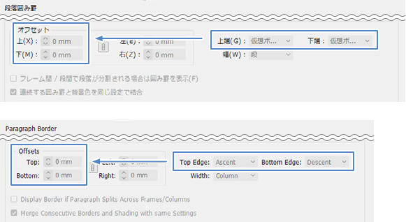
This function lays a zabuton (background band or frame) under the paragraph. It is best to first set the "Top Edge" and "Bottom Edge" of the zabuton, then fine-tune the "Offsets." The default for the Japanese version is top edge = top/right of the virtual body, bottom edge = bottom/left of the virtual body. The default for the English version is top edge = ascent, bottom edge = descent.
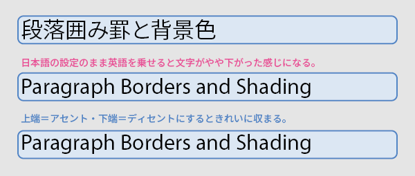
If you place English text on top of the Japanese settings as they are, the characters will appear slightly lower relative to the padding, so adjustment is necessary. Usually, simply setting the top and bottom edges to the English version’s ascent and descent will make it fit well. Usually. However, there are cases where this does not work well.
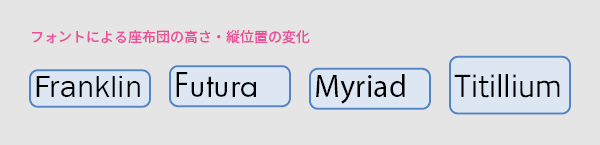
Japanese characters tend to fit neatly within the zabuton (background cushion), so this is not often noticed. However, for Latin and multilingual text, the glyph shapes vary depending on the font, causing changes in the zabuton’s height and vertical position. This is usually not very noticeable when used as a shading pattern in body paragraphs, but it might be somewhat noticeable in headings. Sometimes, the zabuton can become so large that it cannot be ignored.
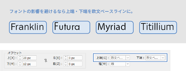
To specify the height of the zabuton as a fixed value unaffected by the font, set both the top edge and bottom edge to the "Latin Baseline" and adjust the offset values up and down. At this time, although you can create a zabuton of any height by methods other than paragraph borders or shading—such as using tables or inline placement of text frames—doing it with a single paragraph style is generally easier to work with and more robust for corrections.
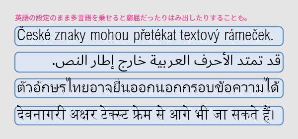
In work that expands from Japanese to English to multiple languages, some compromise is unavoidable: either unify the font size and give up on the zabuton (background padding) size, do the opposite, or gradually meet somewhere in between. If you dislike compromise, prepare zabuton sizes at the Japanese production stage that anticipate English and multilingual needs. You will likely need to match the language with the tallest vertical characters among the target translation languages. Be especially careful with Arabic, Thai, Devanagari, and similar scripts.
If you typeset Japanese without considering the future, you should give up on unifying the zabuton size and prioritize the font size. Reducing the font size of multilingual text to fit on the smaller Japanese zabuton will decrease legibility and disrupt the balance of font sizes with other texts. While creators might be bothered by inconsistent zabuton sizes, readers are unlikely to deliberately compare Japanese, English, and multilingual texts to nitpick.
Please also see past articles regarding the idea that instead of forcibly cramming text into limited space, the space itself should be expanded.
>Related Blog: Multilingual Typesetting Notes: Avoiding Condensed Fonts
Main Reference Materials
Yuji Mori, "InDesign Perfect Book," That's, 2024




















 Return to the top of the page


 +81 35-321-3111[Tokyo Headquarters]
  Contact Us
 Request for Information