This is the third installment considering paragraph styles when translating and adjusting the layout of Japanese InDesign data to create an English version, and then expanding it to European languages and multilingual versions. This time, there are items that affect not only readability but also work efficiency. If you roughly fudge things in the previous process (Japanese-English), it will impact the quality and cost in the subsequent process (multilingual), so let's carefully review it.
Table of Contents
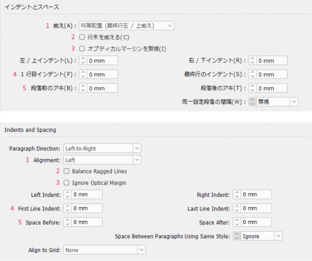
Indents and Spacing|Indents and Spacing
2. Balance Ragged Lines|Balance Ragged Lines
Indents and Spacing|Indents and Spacing
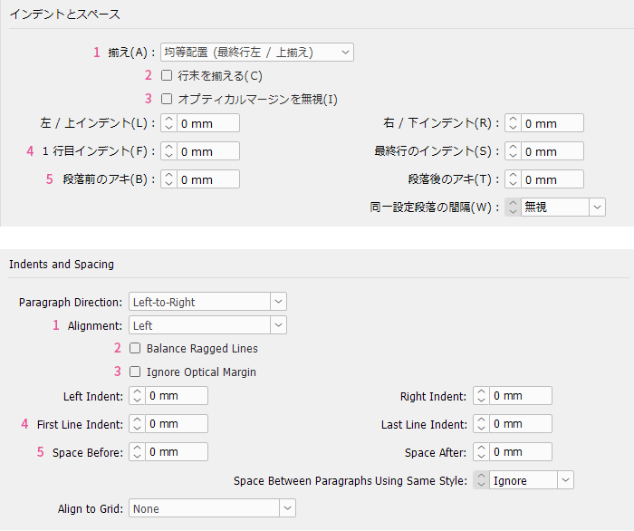
1. Alignment|Alignment
The default setting in the Japanese version of InDesign is justified alignment, whereas the default in the English version is left alignment. Japanese typesetting is generally justified, but Western typesetting varies case by case. When adapting from Japanese to English, are you leaving the alignment thoughtlessly justified? There is no need to unify alignment between Japanese and English. In some cases, switching to left alignment will be much better.
For typesetting long texts to be read straightforwardly, such as literary books, either justified or left-aligned text is fine. However, for typesetting that combines various short texts like headings, body text, procedures, and notes, as in practical books or manuals, left alignment is better, and there is little advantage to using justified text.
Please also see here about alignment.
>> Multilingual Typesetting Notes: Adjusting Typesetting Layout with Hyphenation
2. Balance Ragged Lines|Balance Ragged Lines
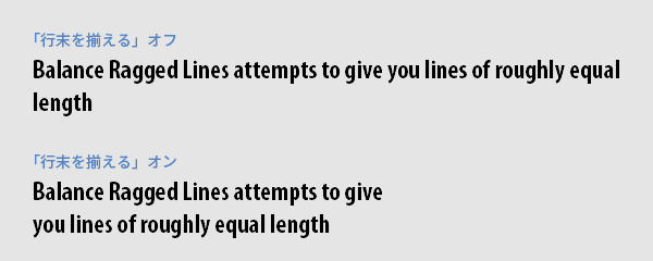
This feature balances uneven line endings and operates when using the paragraph composer with alignment other than justified. It may be suitable for headings, but since it mechanically equalizes line lengths, manual adjustment is necessary if you want to control line break positions. Also, because it evens out the entire paragraph including the last line, line lengths tend to be shorter than the column width, making it less suitable for body text.
3. Ignore Optical Margin|Ignore Optical Margin
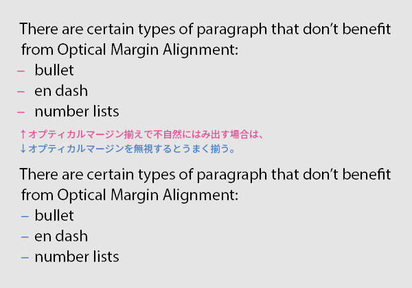
Optical margin alignment is a feature that slightly extends punctuation marks or characters with large margins (such as A, T, V) at the beginning or end of a line beyond the text frame, so they visually appear aligned even if they seem indented. When used skillfully, it makes typesetting look cleaner. For paragraphs like bulleted lists or automatic numbering where overflow is unnecessary, it is better to "Ignore Optical Margin."
4. First Line Indent
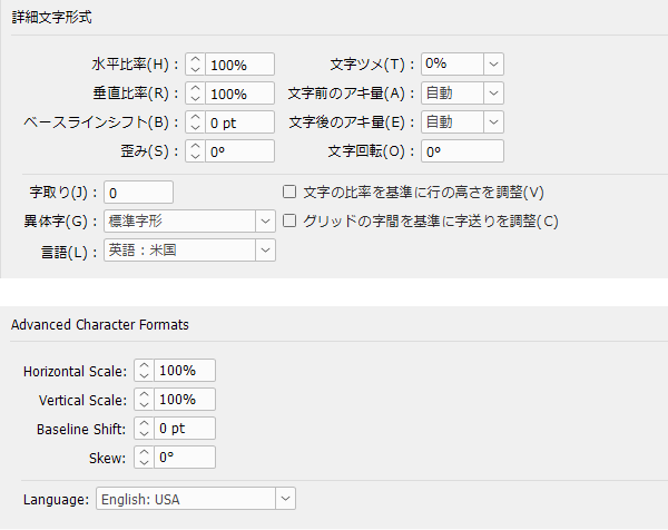
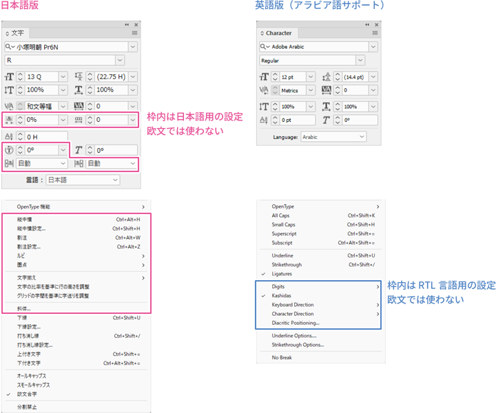
For literary book typesetting, first-line indent is suitable for paragraph boundaries. This is because the line spacing remains constant, which does not disrupt the reading pace. In Japanese, the indent is one character, but that is not enough for English. It is expanded to the minimum width that makes it immediately clear that this is the start of a paragraph. If you had been indenting using “Japanese Typesetting → Character Composition,” it will be ineffective with the Roman/multilingual composer, so you need to reset it here.
Please also see here about first line indent.
>> Multilingual Typesetting Notes: Clarifying Paragraph Boundaries
Using multiple spaces or full-width spaces for indentation is forbidden. Unlike Japanese, the width of spaces in Latin text varies depending on the font, so the indentation width for English and multilingual text cannot be properly controlled. Also, full-width spaces do not exist in Latin fonts and will cause garbled characters. It is desirable to create data with English and other languages in mind from the Japanese production stage.
5. Space Before/Space After
For typesetting practical books and manuals, it is appropriate to separate paragraph boundaries with paragraph spacing. This is because the structure often consists of heading → main text, figure → explanation, screen → procedure, and grouping by item takes priority over reading pace. A spacing amount of half a line or one line is suitable.
Please also see here about paragraph spacing.
>> Multilingual Typesetting Notes: Clarifying Paragraph Boundaries
Using blank lines to create paragraph spacing is forbidden. This is because, as a result of revisions or translations causing the number of lines to increase or decrease, meaningless blank lines may appear at the beginning of a paragraph. If spacing is created using space before and after paragraphs, this will not happen.
Tabs
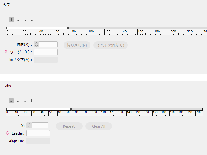
This setting is used to align the horizontal position of text in bulleted lists, tables of contents, indexes, and the like. It works in conjunction with "Indent and Space" and "Bullets," so if you only need simple indentation or bulleted lists, it is better to use those. "Tabs" are used when you want more precise control over alignment, such as tabs other than left-aligned ones or when setting multiple tabs on a single line.
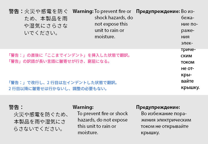
Inserting a "Indent to Here" character to indent lines after the second line is convenient but not highly recommended. This is because the indent width is affected by the font, font size, word length, and character width of the line where the "Indent to Here" is inserted, making it difficult to control. For simple bulleted lists, it is better to set them using "Bullets," and in cases like the illustration, it is preferable to create the layout without using "Indent to Here."
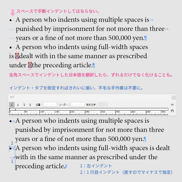
Indenting bullet points by repeatedly pressing the space bar or using full-width spaces is out of the question and must be considered faulty data. It will never align neatly, and every time adjustments or translations cause shifts in spacing, it will need to be redone, resulting in lower quality and increased workload. Indents and tabs must be correctly set at the Japanese-English stage. Passing faulty data to subsequent processes is tantamount to obstructing work.
6. Leader
When setting leaders in tables of contents and the like, the Japanese interpunct or the triple dot leader cannot be used in Western text. Usually, periods are used, but if they are placed tightly without gaps, it becomes visually unpleasant, so they should be spaced out. It is sufficient to space them so that the correspondence between the table of contents entries and the reference page numbers is not mistaken.
For information on dotted lines in the table of contents, please also see here.
>> Multilingual Typesetting Notes: Punctuation
Main Reference Materials
Nigel French, InDesign Type: Professional Typography with Adobe InDesign (3rd edition), 2014