What do you think of this tweet?
Hmm, I can't agree.
— Taro Kono (@konotarogomame) April 29, 2020
Two spaces between sentences are incorrect, Microsoft has ruled, and will enforce it in Word https://t.co/hP1PPHrcgt @cnn_co_jp
I understand how you feel. For those with experience in Western typography, being called out for double spacing at the end of a sentence can feel strange. As a typesetter, I would like to welcome this change as it reduces one step in the process.
Table of Contents
>>Translation Services from Human Science, a Localization Company
>>Related Materials: Nine Cases of Machine Translation Errors and Post-Editing & Post-Editing Checklist
Bad Example
Improvement Proposals
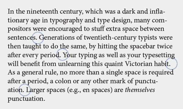
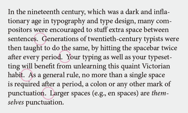
One space after punctuation
Punctuation marks indicate pauses in a sentence. The degree of separation increases in the order of "," → ";" → ":" → "." with the full stop (period) being the sentence-ending punctuation. There should be no space before the preceding character. Only one space should be left after it. You must not leave two or more spaces here. This is because it can create a moth-eaten appearance at the end of sentences, resulting in an uneven texture in typesetting and disrupting the rhythm of reading.
In 19th-century typesetting, large spaces were left between sentences. Typists in the 20th century did the same thing with double spacing. Both are incompatible with modern typesetting. Even in the 21st century, we encounter text manuscripts with double spaces, but during typesetting, we replace them with a single space instead of leaving them as is. The habits of typewriters and the rules of typesetting are two different things.
I imagine that Mr. Kono is not satisfied because, although he has learned about Western typography, he has never typeset using metal type or DTP. At the manuscript stage, having two spaces is not particularly problematic, but once we move to the typesetting stage, he must accept just one space.
Punctuation varies by language
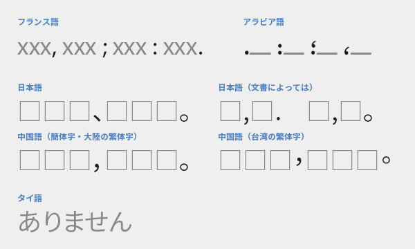
Unlike English, French requires a space before colons and semicolons. In Arabic, commas and semicolons bounce up rather than down. While Japanese is often thought of as using ",", "/", and ".", it can also be written as ",", "/", or "." in horizontal writing. Even in Chinese, the placement of punctuation differs between the mainland and Taiwan. Additionally, some languages, such as Thai, do not have punctuation marks at all.
Bonus: Dotted Line
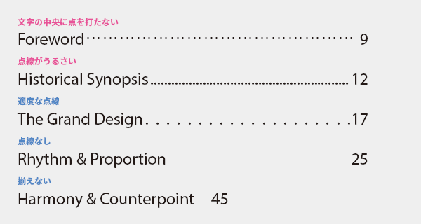
When connecting items and references in a table of contents or index with dotted lines, do not use middle dots or ellipses. In Japanese, there is a tendency to place dots in the center of the characters, but in Western languages, dots are placed on the baseline. If the density of the dots is too high, it can feel cluttered, so it is better to space them out appropriately. Additionally, there is no problem at all with not using dotted lines, and it is common to see typesetting that is not aligned with tabs.
>>Translation Services from Human Science, a Localization Company
>>Related Materials: Nine Cases of Machine Translation Errors and Post-Editing & Post-Editing Checklist
Main Reference Materials
Robert Bringhurst, The Elements of Typographic Style (4th ed.), 2012
Akira Kobayashi, 『Western Typefaces: Their Background and Usage』, Bijutsu Shuppansha, 2005
Masao Takaoka, "Typesetting in Western Languages: Basics and Manners," Bijutsu Shuppansha, 2010