Table of Contents
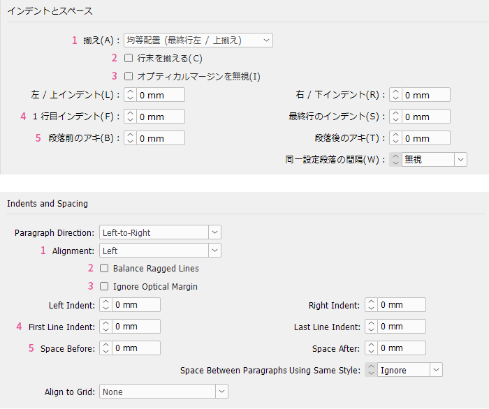
Advanced Character Formats|Advanced Character Formats
Advanced Character Formats|Advanced Character Formats
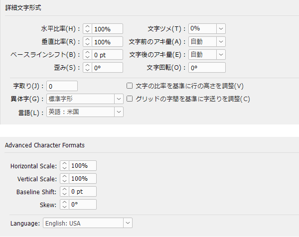
Horizontal Scale|Horizontal Scale
Try to keep the horizontal scale at 100% and avoid changing it as much as possible. Narrowing the character width is called "chotai" (condensed style), and it is often casually used to fit text into limited space. However, this distorts the shape of the characters, reducing readability, and it also looks like a sloppy, rushed job.
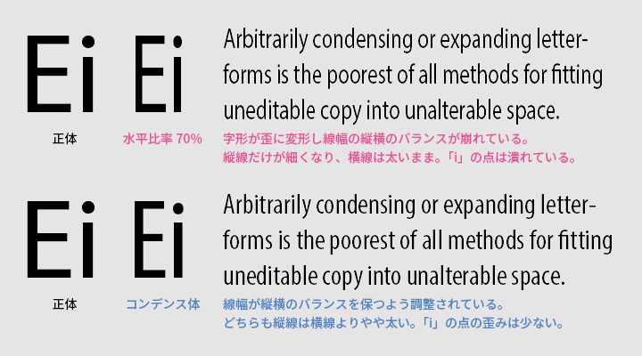
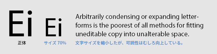
If you absolutely want to narrow the character width, change the font to a condensed type instead of using elongated characters. However, this is only slightly better than elongation and is by no means easy to read, so avoid overusing it. If you want to fit text without significantly reducing readability, it is better to reduce the font size rather than use a condensed font.
Please also see here for information about condensed type.
Vertical Scale|Vertical Scale
Like the horizontal scale, the vertical scale should not be arbitrarily changed from 100%. Flattening the characters is called "heitai" (flat style), and you will likely only see this in Japanese newspaper typesetting.
Baseline Shift|Baseline Shift
Baseline shift is a function that fine-tunes the vertical position of symbols and the like on a per-character basis, but when applied to an entire paragraph as a style, it can feel somewhat off. Are you perhaps patching over issues with vertical text positioning—such as line spacing, paragraph spacing, or alignment within table cells—without properly resolving them? This can cause problems in later stages, so it is worth considering whether there are more appropriate adjustment methods available.
Skew|Skew
This is a function to manually skew characters, but you will rarely need to use it in the main text. If you want to slant text for emphasis, Western typefaces have italics, and in many non-Western languages, italics or similar slanted styles are often not used.
Please also see here for information about italics.
Character Tightening / Space Before Character / Space After Character / Character Rotation / Character Fit / Alternate Glyphs|――
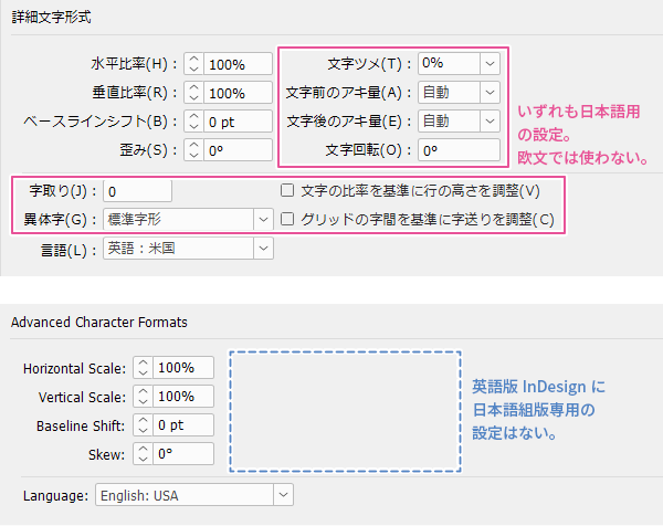
All of these are functions for Japanese typesetting and are not used in Western typesetting. They are disabled when switching the composer from Japanese to Western or multilingual. The English version of InDesign does not have these settings at all. Japanese typesetting and Western typesetting are completely different systems, so please switch your mindset accordingly.
>>Japanese typesetting and Western typesetting are completely different, so switch your mindset
Language|Language
This setting is essential for hyphenation and spell check to function correctly. Please select the correct language.
Please also see here for information about hyphenation.
Multilingual Typesetting Notes: Improving Layout with Hyphenation
Main Reference Materials
Robert Bringhurst, The Elements of Typographic Style (4th ed.), 2012
Nigel French, InDesign Type: Professional Typography with Adobe InDesign (3rd edition), 2014