What do you think of this layout?

This is a brochure for foreigners that was placed at the station. There are parts of this layout that may not be suitable for foreigners. How should I modify it and in what way?
>> Translation Services from Human Science
>>Related Download Materials: Nine Examples of Machine Translation Errors and Post-Editing & Post-Editing Checklist
Disadvantages

Improvement Proposals

Do not use symbols unique to Japanese
Symbols unique to Japanese only work in Japanese, so they cannot be used as is in foreign languages. They need to be replaced with phrases that have similar meanings or functions. Please do not bring Japanese symbols into Western typesetting.
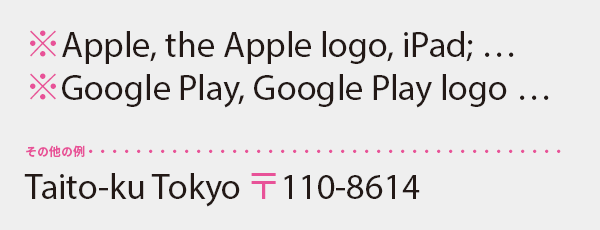
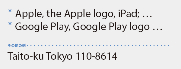
The symbol * is a stylized representation of the kanji character for 'rice', which Western readers have never seen and does not convey any meaning. It may also appear as a strange emoji to Chinese viewers, as it is not very familiar to them. I think it would be better to replace * with this symbol.
The postal code symbol is said to be a stylized representation of the first letter "T" from the former Ministry of Communications, which was the predecessor of the now-defunct Ministry of Posts and Telecommunications. Naturally, it should not be applicable in foreign languages. Simply adding the postal code after the city name is sufficient.
These symbols are not included in Western fonts, but they can be displayed using Japanese fonts, and even without them, they can be outlined for inline placement. However, before doing so, please use a little imagination. Why are these symbols not included in Western fonts? Is it not because they are not applicable in Western notation, and therefore no one uses them?
Explain what ◎○△× means

Symbols unique to Japanese only work in Japanese, so they cannot be used as is in foreign languages.
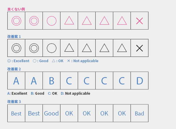
The symbols ◎○△× represent evaluations such as excellent/good/fair/poor, which do not have the same meaning in foreign languages. Therefore, it is necessary to clearly indicate what each symbol means (Improvement Proposal 1).
However, these symbols are unfamiliar to foreign language readers and are not included in Western fonts. It would be better to replace them with numbers or ABC (Improvement Proposal 2), or to replace them with short words that fit within the grid (Improvement Proposal 3). For a simple ○× table, I think it would be fine to replace the circle with a "✔".
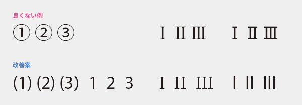
Replace double-byte characters such as circled numbers and Roman numerals with single-byte characters

It may be repetitive, but Japanese-specific symbols cannot be used as they are in foreign languages.
The circled numbers ①②③ are understandable in meaning, but they are rarely used. Additionally, they are not included in Western fonts, which forces the use of a mix of Japanese fonts and symbol fonts, leading to a lack of consistency. Simply using (1), (2), (3) or 1, 2, 3 would be sufficient.
I II III The two-byte Roman numerals with serifs (the small projections at the ends of the strokes of the letters) are characters designed for vertical typesetting to fit within Japanese grid squares, and they are not available in Western fonts. In Western text, simply arrange the Latin characters. There is no problem if the serifs are not connected.
It is not just a matter of replacing it with a similar symbol.
Unique symbols in Japanese are... (omitted below).

Since China and Korea use [ ], the original Japanese must be similar. In English, [ ] is used instead, but [ ] strongly indicates typos, omissions, and corrections, and cannot replace [ ]. Let's not judge based on visual similarity but consider meaning and function. If you want to create a sense of uniformity in multilingual notation, I recommend not using symbols unique to certain languages, such as [ ], from the beginning.

Some mathematical symbols such as ≒, ≦, and ≧ are not universally recognized. Symbols that differ by country or region need to be replaced with those of the respective language.
Even if the same symbol is fine, convert 2-byte characters to 1-byte characters

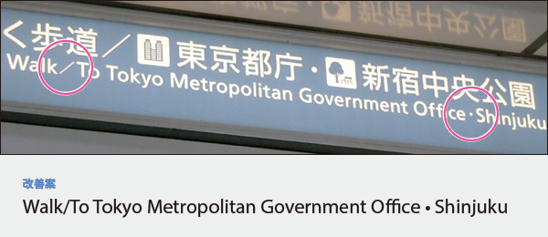
Let's avoid using 2-byte characters just because they resemble Western symbols in shape and function, such as /, !, ?, $, %, &, ¥, @, ;, :, *, <, >, etc. They do not harmonize with Latin characters, leading to a sense of discomfort. The left slash in the photo is too thin and too wide, while the middle dot on the right is too small.
Japanese typesetting and Western typesetting are completely different, so switch your mindset.
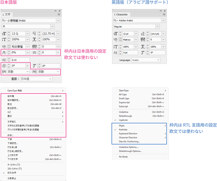
This time, we addressed the mistake of applying Japanese typesetting methods to Western typesetting. Unlike languages such as Thai and Arabic, we are familiar with Latin characters. As a result, when typesetting in Western languages, the awareness and tension of "dealing with a foreign language" become weak, leading to issues such as ignoring the conventions, rules, and agreements of Western typesetting, making judgments based on appearance, or applying Japanese typesetting concepts to Western typesetting.
Typesetting is not just about flowing text into DTP and finishing off the overflow. To ensure that the content of the text is easily absorbed by the reader without being hindered by the discomfort of typesetting, it is important to have a correct understanding of the conventions, practices, and agreements of typesetting, and to respect the differences between languages.
>> Translation Services from Human Science
>>Related Download Materials: Nine Examples of Machine Translation Errors and Post-Editing & Post-Editing Checklist
Main Reference Materials
Mari Tashiro and Akira Kobayashi "Ask the Translators: English Typesetting for Readers in the English-Speaking World" TypeTalks No. 22 (Seminar), 2014
Shogakukan Dictionary Editorial Department "Dictionary of Punctuation, Symbols, and Marks Usage." Shogakukan, 2007
Seiko Makikura "Beautiful Books and Typesetting in Europe: Typesetting Conditions from a Typographer Living in Germany" TypeTalks No. 35 (Seminar), 2016
