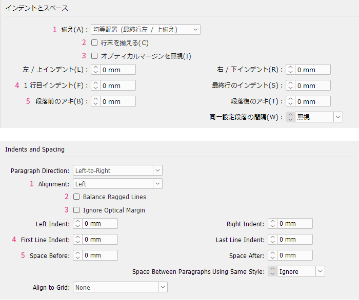
What do you think of this layout?
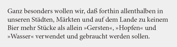
There are three phrases I want to emphasize in the text, but this is not a very good method. What would be a better way to emphasize them?
Table of Contents
>>Translation Services from Human Science, a Localization Company
>>Related Materials: Nine Cases of Machine Translation Errors and Post-Editing & Post-Editing Checklist
Disadvantages
Improvement Proposals
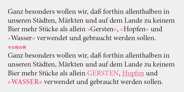
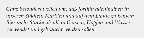
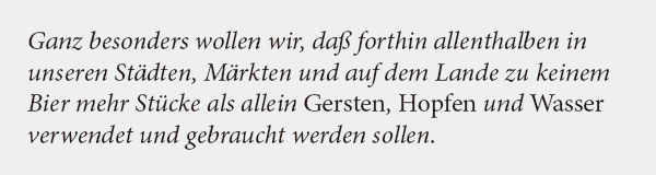
Emphasis is italic or bold
In Japanese, phrases are sometimes emphasized with quotation marks, but this is not common in Western languages. Enclosing text in quotation marks adds a nuance of "not literally." There is also a term in Japanese that translates to "with parentheses," but think of it as having a stronger emphasis. Just because Japanese uses quotation marks does not mean it should be indiscriminately applied to other languages.
Additionally, avoid using uppercase letters as they can be distracting. Underlining is a convention from typewriters where italics and bold cannot be used, and it is not used in typesetting. Combinations like bold + uppercase + quotation marks are too conspicuous and vulgar.
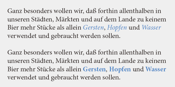
The first choice for emphasis is italic. It allows for emphasis without compromising readability. Bold provides a stronger sense of emphasis because it stands out more than italic. I believe that italic is suitable for plain typesetting like books, while bold is more appropriate for complex typesetting like instruction manuals.
What to do in such cases?
If the entire text is set in italics, it cannot be emphasized in italics. You may be tempted to use bold, but there is actually a better way. What should be done?
Answer
I will use Roman type. It may be surprising, but it is sufficient for the emphasized phrases to stand out relatively.
What is Italic?
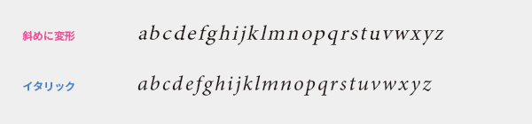
Italic is a handwritten-style slanted typeface used as a complement to Roman type. In addition to emphasis, it is used for the notation of foreign words, literature titles, work titles, scientific names, and more. Italic is designed as a separate typeface from Roman. Instead of slanting the characters through transformation, let's switch to an italic font.
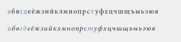
There are significantly altered characters in Cyrillic italics, which may confuse those without knowledge, but that's just how it is, so there's no need to worry. Also, italics or slanted types are not commonly used outside of Western scripts. For example, just because English is in italics, there is no need to slant Arabic or Thai indiscriminately.
>>Translation Services from Human Science, a Localization Company
>>Related Materials: Nine Cases of Machine Translation Errors and Post-Editing & Post-Editing Checklist
Main Reference Materials
Butterick's Practical Typography (https://practicaltypography.com/)
Akira Kobayashi, 『Western Typefaces: Their Background and Usage』, Bijutsu Shuppansha, 2005
Masao Takaoka "ABC of Western Typesetting: Intermediate Edition" TypeTalks Subcommittee (Course), 2015