What do you think of this layout?
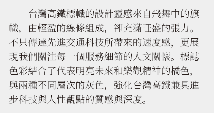
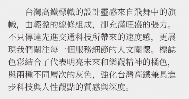
Although this is a layout in Chinese (Traditional), I think Taiwanese people may feel a sense of discomfort when they see it. It should be Traditional Chinese for Taiwan, so what does this mean?
Table of Contents
Disadvantages
Improvement Proposals
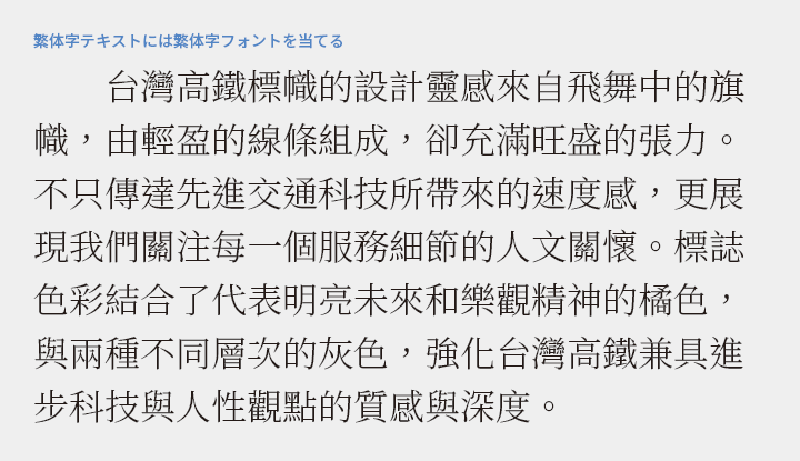
There are two types of Traditional Chinese characters
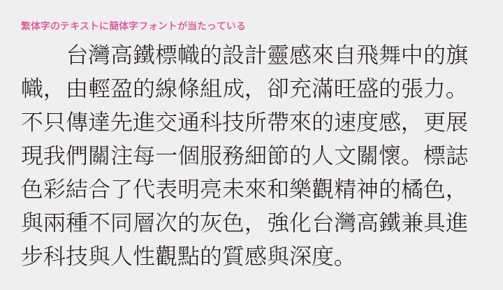
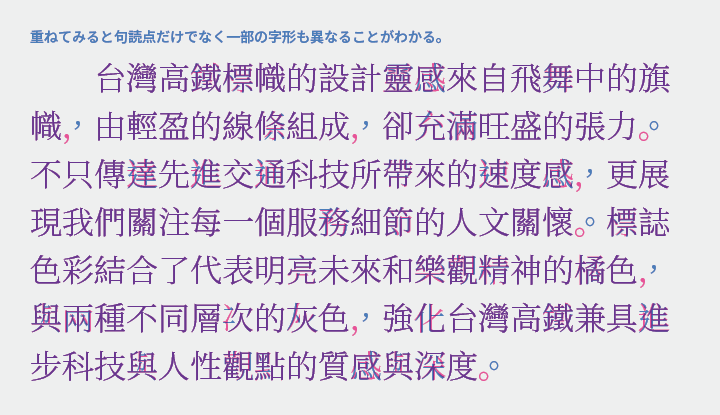
Traditional Chinese characters differ between Taiwan and mainland China, with Taiwan using the "Guozi Standard Font" and the mainland using the "New Character Form." The differences are most noticeable in the placement of punctuation, but there are also variations in the shapes of some characters. The above "bad example" features a simplified font applied to a traditional Chinese text, which may feel unfamiliar to Taiwanese readers due to the unusual character shapes. Traditional Chinese characters require different fonts depending on the destination.
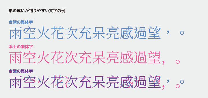
Veteran typesetters may remember Chinese fonts as a binary classification: Traditional Chinese = Big5 and Simplified Chinese = GB (2312). Subsequently, GB2312 evolved into the GBK standard and then into GB18030, significantly increasing the number of characters included. It now supports not only Simplified Chinese but also Traditional Chinese and characters from minority languages. However, the forms of Traditional Chinese characters differ from those used in Taiwan. It is important to note that a single Simplified Chinese font does not suffice for typesetting Traditional Chinese for the Taiwanese market.
Here are some differences between the mainland and Taiwan
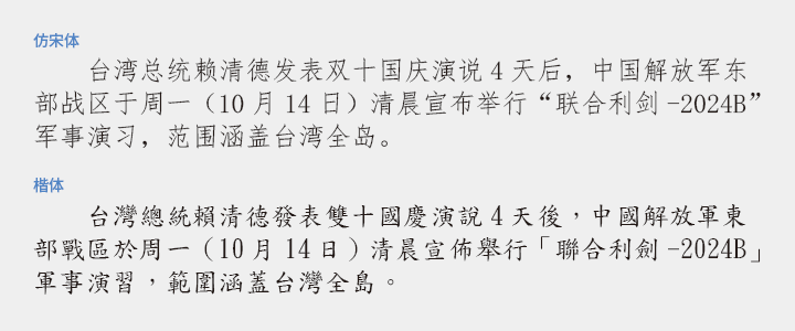
The four basic Chinese typefaces are Songti, Heiti, Kaiti, and Fang Songti. Songti corresponds to Mincho, Heiti corresponds to Gothic, and Kaiti corresponds to Kaisho, but Fang Songti may not be commonly seen in Japanese typesetting. Fang Songti is often used in official documents and government-related media in mainland China, giving it a somewhat formal impression. In Taiwan, Kaiti tends to be used in such contexts. This highlights the differences between mainland China and Taiwan.
Major Font Manufacturers
The top market share in the mainland is held by Founder, followed by Hanyi. Other well-known names include DynaComware and Arphic from Taiwan, and Monotype from Hong Kong. Among domestic products, the Chinese version of Hiragino Kaku Gothic has received high praise. The Source Han Sans/Serif (Noto Sans/Serif CJK), co-developed by Adobe and Google, also seems to be quite good.
Arabic characters
Avoid Arial and Times New Roman
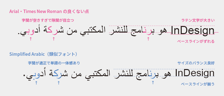
The standard Western fonts, Arial and Times New Roman, also include Arabic characters. You might think that it would be easier to work with the same font as English, but I strongly recommend against using them. There are two reasons for this. One is that the kerning is poor, often making it look like there are spaces in the middle of words. The other is that the size balance with Latin characters is off, and the baselines do not align.
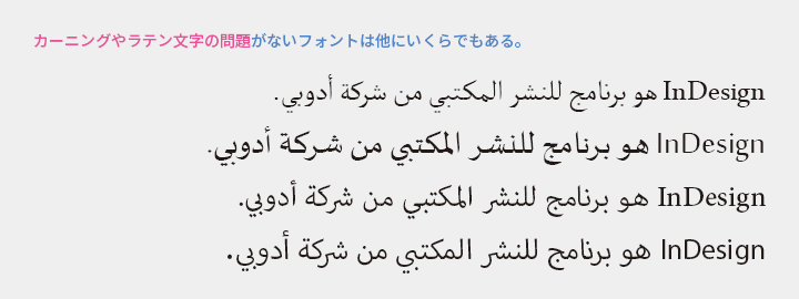
There are plenty of fonts with proper kerning and good balance with Latin characters, so I recommend choosing from those. In the first place, the designs of Arial and Times New Roman are not particularly easy to read. Did you choose this font because you carefully considered and liked it? Surely not, right? Let's stop using it out of habit.
If you don't understand well, leave it to the vendor
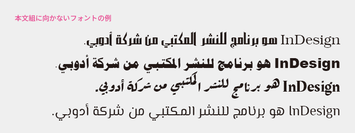
Based on experience, when showing font samples to users unfamiliar with Arabic, they tend to choose inappropriate fonts at a fairly high rate. To avoid this, we try to suggest fonts as much as possible. I believe that selecting fonts is difficult for those who are not knowledgeable about language and typesetting, so I recommend leaving it to a reliable vendor.
Thai
Differentiating Between With Loop and Without Loop
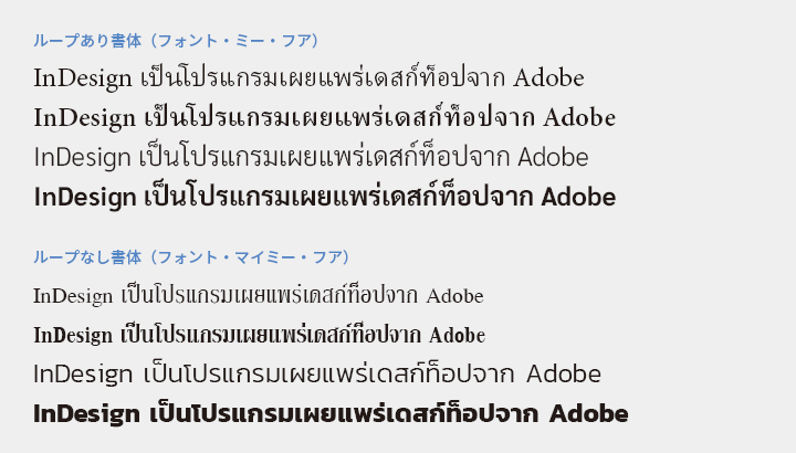
There are various typefaces in Thai, but they can be broadly divided into two categories: looped fonts (Font Mee Hua) and non-looped fonts (Font Mai Mee Hua). Looped fonts are suitable for reading purposes, such as in book texts. Non-looped fonts are used for display purposes, such as in advertisements, signs, and book covers, and are not very suitable for long texts.
Typefaces with thick vertical lines and thin horizontal lines, like Mincho, pair well with Western serif fonts, while typefaces with uniform lines, like Gothic, seem to pair well with Western sans-serif fonts.
It is quite common to differentiate between headings using a non-loop font and body text using a loop font. Occasionally, some users may be confused due to changes not only in thickness but also in the shape of the characters, but from a native perspective, there is absolutely no problem.
Main Reference Materials
Liu Qing "ABC3 of Chinese Typography and Typesetting" TypeTalks No. 37 (Seminar), 2016
Goto Masatoshi Office "How to Use Thai Fonts: Free and Paid Downloads and Recommended Fonts"
>>Related Materials: Post-Edit Quality Check Sheet Download

