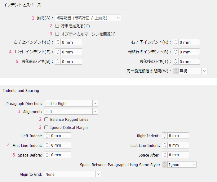
What do you think of this layout?
Pay attention to the font and take a look at the overall layout. Do you feel something is off? How can we resolve that discomfort?
Table of Contents
>>Translation Services from Human Science, a Localization Company
>>Related Materials: Nine Cases of Machine Translation Errors and Post-Editing & Post-Editing Checklist
Disadvantages
Improvement Proposals
Combine fonts to achieve a sense of unity or contrast
When combining multiple fonts, it is not ideal to mix similar fonts as it creates a half-hearted effect. It is better to either create a sense of unity or add contrast.
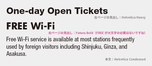
The heading on the left page is a simple and generic Helvetica, while the heading on the right page is a geometric-looking Futura. The body text, aside from the headings, is in condensed Helvetica. I don't think mixing in Futura here would be effective. It doesn't stand out in any particular way; it just looks mismatched.
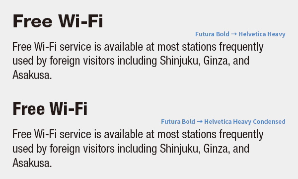
To create a sense of unity, it is standard practice to combine variations of the same font family. Adjusting the headings to a condensed style to match the body text further enhances the sense of unity.
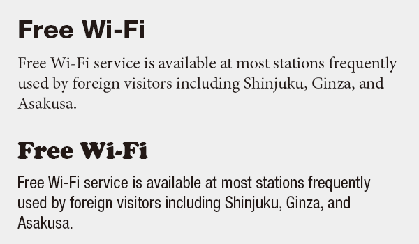
Conversely, if you want to emphasize contrast, combining clearly different fonts, such as sans-serif and serif (above), or decorative fonts and body text (below), will highlight the differences.
Unintended Contamination
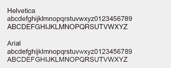
It is not uncommon to see a mix of Helvetica and Arial. The differences in their letterforms are so subtle that they may go unnoticed, but there is an indescribable sense of discomfort, and it seems unlikely that this mix was intentional. It is likely that over many years of revisions or by reusing parts from other manuals, this mix was unintentionally introduced. I recommend that it be checked once.
>>Translation Services from Human Science, a Localization Company
>>Related Materials: Nine Cases of Machine Translation Errors and Post-Editing & Post-Editing Checklist
Main Reference Materials
Butterick's Practical Typography (https://practicaltypography.com/mixing-fonts.html)
Akira Kobayashi "Fonts that are 'Similar'" The Eye of a Type Director (https://blog.excite.co.jp/t-director/10584464/)
Masao Takaoka 'Western Typography: Basics and Manners of Typesetting' Bijutsu Shuppansha, 2010