What do you think of this layout?
I would like to correct the distracting formatting in this layout. How should I modify it to improve it?
Table of Contents
>>Translation Services from Human Science, a Localization Company
>>Related Materials: Nine Cases of Machine Translation Errors and Post-Editing & Post-Editing Checklist
Disadvantages
Improvement Proposals
Do not capitalize the entire word
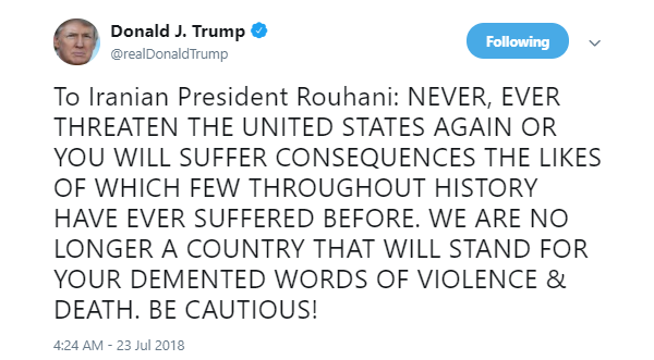
It is standard practice to capitalize only the first letter of proper nouns. You should not write the entire word in uppercase. Using all capital letters creates a more aggressive impression than Japanese people might imagine, giving readers the feeling that they are being shouted at, which can be seen as vulgar. This can damage the credibility of the document and, by extension, the image of the product or company.
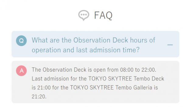
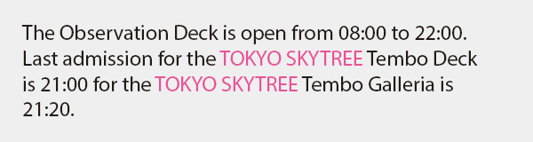
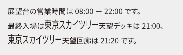
Additionally, the use of uppercase words is too conspicuous and distracting, disrupting the tone and rhythm of the text, making it physically difficult to read. Moreover, the main subject of this text should be the business hours, yet the facility name stands out too much, blurring the primary message that we want to convey.
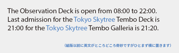
Even if the logo or product name is made up entirely of uppercase letters, the situation is different in the body text. The purpose of the text is not to reproduce the logo but to convey information, so let's prioritize readability by replacing letters other than the initial with lowercase. Also, Observation Deck should not be treated as a proper noun, so it should be in all lowercase.
This may be a bit off-topic, but writing it as Tembo not only fails to convey meaning to foreigners, but it also does not communicate that it is a pun on the word for "view" by using the characters for "heavenly view." The important thing is the transmission of information, so (for the second time) this should have simply been translated as observation deck / observation corridor. Whether to retain proper nouns from the source language depends on the context.
For example, in Japanese
You might not understand what is meant by being vulgar or distracting, so I will give an example in Japanese. It seems to be insisting, "Remember the name!" This kind of typesetting is strange, isn't it? It's fine to use capital letters for things meant to catch the eye, such as signs, billboards, book titles, or product names on packages. However, let's avoid using capitalized words in the main text, which aims to be read.
Do not capitalize the entire text
This time, the entire text is in uppercase. What a situation. If you shout like this, everyone will turn away and cover their ears.
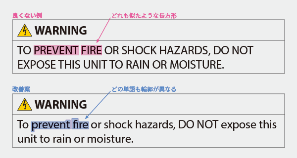
Using all capital letters makes it stand out, but it becomes extremely difficult to read. This is because the uniform height of the letters eliminates the differences in the contours of the words, making them harder to distinguish. It is reasonable to highlight the heading WARNING in capital letters, but since the body text needs to be read and understood properly, readability must be prioritized.
The improvement proposal has revised the main text to standard notation. The term DO NOT has been left in uppercase to clearly highlight important points, but it can also be in lowercase without issue. It seems that there are cases where full uppercase notation is mandated by consumer protection laws, but from a typesetting perspective, it is not recommended at all.
Therefore, unless you want to make the reader feel that it is difficult to read or unappealing, be careful not to use uppercase letters thoughtlessly in Western typography. Do you want to be seen as someone like this?
>>Translation Services from Human Science, a Localization Company
>>Related Materials: Nine Cases of Machine Translation Errors and Post-Editing & Post-Editing Checklist
Main Reference Materials
Akira Kobayashi "Examples of Manners in Western Typesetting: Do Not Reproduce Logos in Text" Type Director's Eye (Blog), 2020
https://blog.excite.co.jp/t-director/29042066/
Masaki Takaoka "Western Typesetting: Basics and Manners" Bijutsu Shuppansha, 2010
Mari Tashiro & Akira Kobayashi "How to Arrange English Information for Readers" Type & 2015 (Lecture), 2015