A paragraph style is a system for registering a set of typesetting settings and applying them to any paragraph, bringing consistency and efficiency to typesetting. In principle, some paragraph style is applied to all paragraphs, so it can be called a "basic style."
There is a similar concept called character styles, but these are, so to speak, "exception styles" used to apply formatting different from the paragraph style (such as bold or italic) to only a part of the text. While it is possible not to use character styles, it is never the case to typeset using only character styles without applying paragraph styles.
From here, I would like to consider paragraph styles when doing Western and multilingual typesetting in InDesign. The scenario assumes translating and adjusting the layout of Japanese page-based DTP data to create an English version, and then expanding it to Western and multilingual versions. The screenshots are from InDesign 2024 and may differ from the latest version.
Table of Contents
General|General
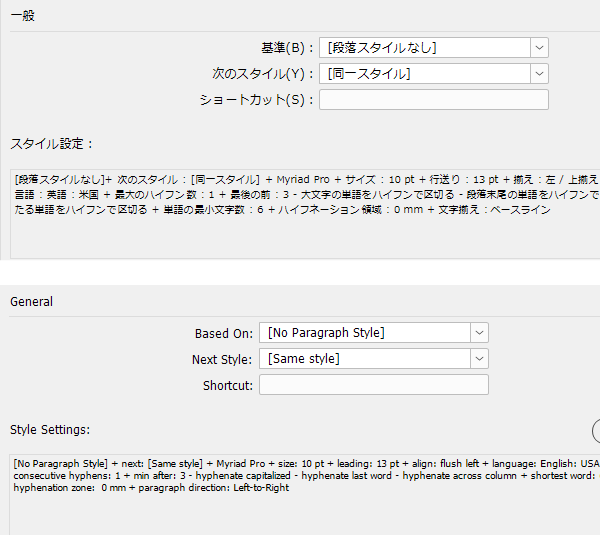
Based On|Based On
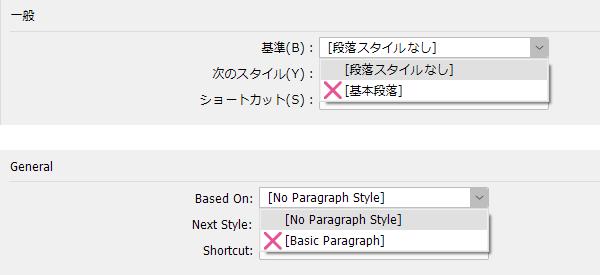
Do not use the style [Basic Paragraph]. Also, do not use it as a basis when creating new styles. This is because copying and pasting text between files with different settings or synchronizing books will cause formatting to break. Use [No Paragraph Style] as the basis, or if you want to add a parent-child structure to styles, base it on other already created styles.
When copying and pasting text between files that have styles with the same name but different settings, formatting will be disrupted. Since the Basic Paragraph style settings differ between the Japanese and English versions of InDesign, opening a file created in one environment in the other environment will hinder work. Also, because the Basic Paragraph style cannot be deleted or renamed but its settings can be changed, even files exchanged between the same Japanese version of InDesign may cause trouble at the receiving end.
While it may be acceptable for work completed entirely by a single person from start to finish, using the Basic Paragraph style in jobs that involve file handoffs with others—such as team work, offshore work, or translation deployment—is strictly forbidden.
Basic Character Formats|Basic Character Formats
Font Family|Font Family
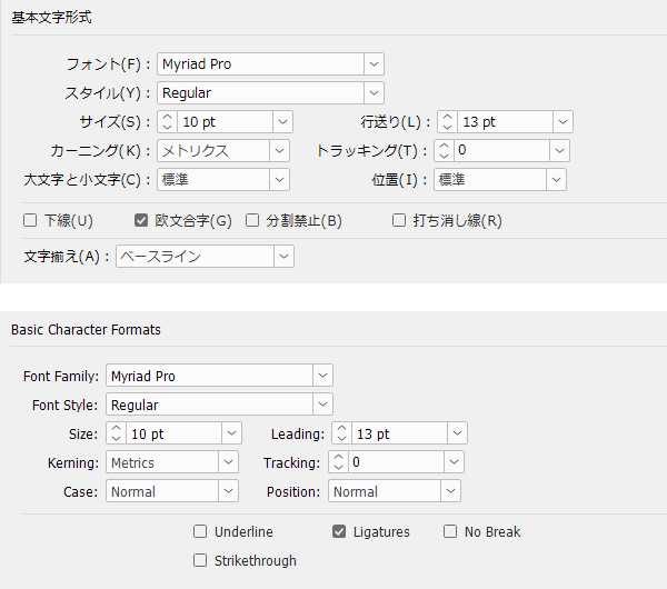
For Western text, use Western fonts; for multilingual text, change to the fonts of each respective language. Do not leave the font as a Japanese font. Dependent Western text (Latin characters attached to Japanese fonts) is intended to be mixed within Japanese sentences and is not designed for setting Western text.
Please also see here for dependent Latin characters.
>> Multilingual Typesetting Notes: Do Not Set Latin Text with Japanese Fonts
Size|Size
When creating the English version based on the Japanese version, it is not always necessary to keep the font size the same. Adjust it appropriately according to the typesetting, space, and amount of text so that it does not feel awkward. When space is limited, reducing the font size is easier to maintain readability than squeezing text with condensed width. The same applies when translating from English to multiple languages.
>> Multilingual Typesetting Notes: Avoid Condensed Width
Also, kyuusu is a unit unique to Japanese typesetting and is not used in Western or multilingual typesetting. In fact, the English version of InDesign cannot handle kyuusu. When producing the English version, the unit is switched to points and fractional values are rounded.
Leading|Leading
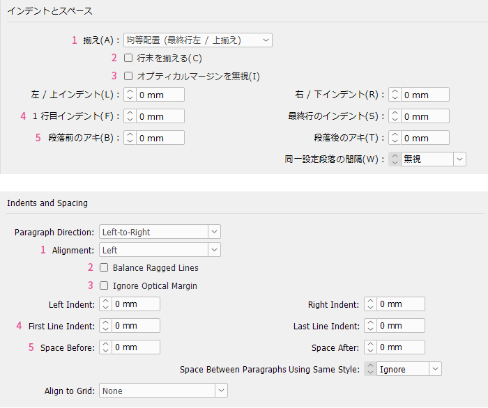
If you keep the Japanese leading as is, it will be too wide for Latin text, so please narrow it. Excessive line spacing negatively affects readability. The default value for automatic leading is 175% for the Japanese version and 120% for the English version, but this is not necessarily the optimal solution. For Latin text, start with 120% of the font size and adjust the leading according to the language, medium, composition width, font, and other factors.
Please also see here about leading.
Multilingual Typesetting Notes: Optimal Line Spacing Varies by Language
Leading should be specified as an exact value after careful consideration of typesetting, but if you use many inline graphics, setting it to "Auto" is also acceptable. The value for auto leading is set separately in "Justification."
Kerning|Kerning
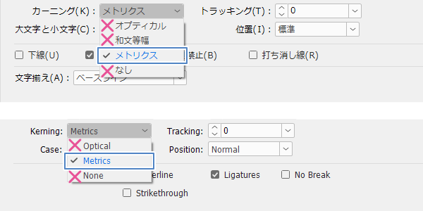
Select "Metrics." Typesetting is based on the font's pair kerning information (spacing information set for each adjacent character pair), meaning it is set with the optimal spacing as designed by the font designer.
"Optical" is generally not used. It is a mode where InDesign ignores pair kerning information and adjusts spacing on its own, which results in a lack of contrast and awkwardness, breaks connections in Arabic script, and causes Thai diacritics to shift from their proper positions, among other issues. Although there are exceptional cases where optical kerning is applied selectively to areas that cannot be properly set with metrics, these are rare exceptions.
"Wabun Tōhaku" (Japanese monospacing) is an unnecessary setting for Western typography. It does not exist in the English version of InDesign.
Tracking|Tracking
In Japanese typesetting, it is often casually adjusted, but in principle, it is fixed at zero in Western typesetting. The letter spacing is carefully designed by the font designer and should not be arbitrarily changed by the typesetting side.
Please also see here regarding letter spacing.
>> Multilingual Typesetting Notes: Do Not Change Letter Spacing
Ligatures|Ligatures
Be sure to check this box. If you do not check it, ligatures in Latin scripts as well as in Arabic and other scripts will be disabled, which looks untidy, and there have also been cases where Thai diacritical marks shifted out of place.
For more about ligatures, please also see here.
>> Multilingual Typesetting Notes: Use Ligatures When Available
Text Alignment|― ―
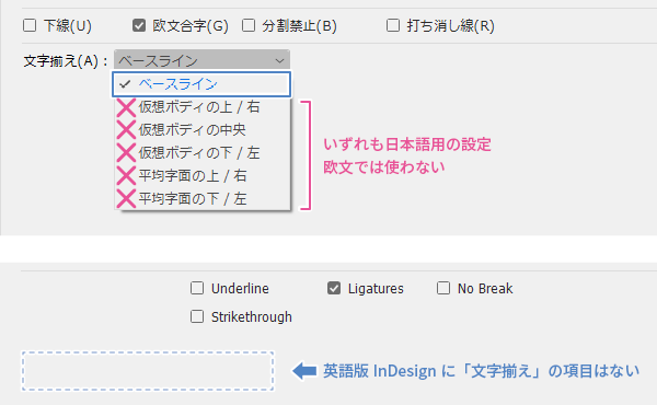
Select "Baseline." All other options are for Japanese typesetting and are not used in Western typesetting. Also, the English version of InDesign does not have this setting at all because there is no choice other than baseline in Western typesetting.
Main Reference Materials
Nigel French, InDesign Type: Professional Typography with Adobe InDesign (3rd edition), 2014
Kontoyoko "Basic Operations of European Typography with InDesign Part 2" and "Basic Operations of European Typography with InDesign Part 3" I Love Typesetting