What do you think of this layout?
This layout is readable for now. However, as you continue reading, you may start to feel a lack of emphasis. What should be modified and how to improve it?
Table of Contents
Improvement Proposal 1: Indent the first line
Proposal 2: Add spacing between paragraphs
Disadvantages
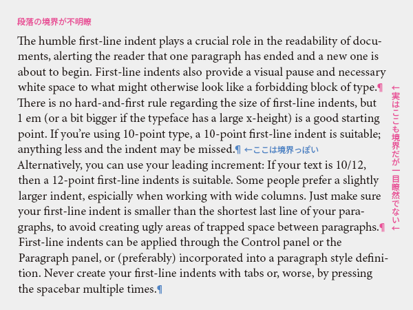
The difficulty with this typesetting is that the boundaries of paragraphs are unclear. Since there is no change at the beginning of the line, it is not immediately obvious where a paragraph begins. Additionally, even if there is a full stop (period) at the end of a line, it does not necessarily indicate the end of a paragraph, and if a long word at the end of a line is broken, it may create a short line that looks like a paragraph boundary even if it is not the end of a sentence. This negatively affects the readability of the text and how easily it can be understood.
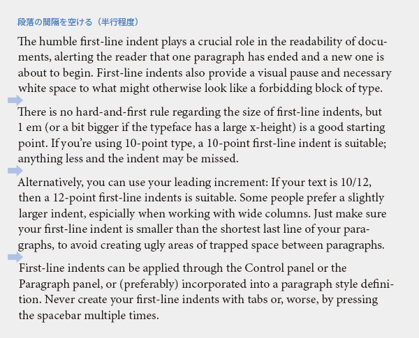
Improvement Proposal 1: Indent the first line
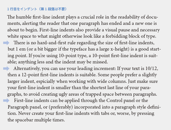
Let's clarify the boundaries of paragraphs. One solution is indentation. The first paragraph and paragraphs immediately following headings do not require indentation, as it is clear where the text begins. Indentation starts from the second paragraph onward. Unlike the improvement proposal 2 mentioned later, this method maintains consistent line spacing, allowing for a pleasant reading experience without disrupting the rhythm, making it suitable for book typesetting. It is also space-saving, making it suitable for newspaper typesetting.
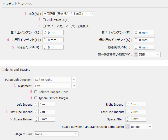
Since the impression changes depending on the font, font size, width, line spacing, etc., it is difficult to uniformly decide "if the font size is X pt, then reduce by Y mm." The starting point is the font size; for example, if it is 10 pt, begin adjusting the indent width from 10 pt and find the minimum indent width that can be recognized as the boundary of a paragraph. Avoid using repeated spaces, full-width spaces, or tabs for indentation, and set the indent width in the paragraph style.
Proposal 2: Add spacing between paragraphs
Another solution is to add spacing between paragraphs. A full line can be too much, so a half-line space is often used. The baseline may not align on the left and right pages, but this is not a concern. When adding spacing, instead of inserting blank lines, let's set the paragraph style to include space before the paragraph. This is to avoid unexpected blank lines appearing at the top of the page when the amount of text increases or decreases.
I believe that for product manuals and educational texts, it is more appropriate to use paragraph spacing rather than indentation. This is because the structure often consists of elements like "heading → body", "figure → description", and "screen → procedure", and I want to prioritize the coherence of each item over a comfortable reading flow.
Avoid using both Proposal 1 and Proposal 2
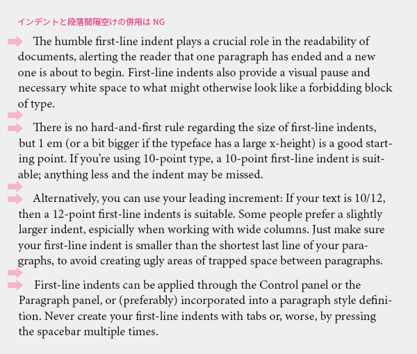
Indentation and paragraph spacing are similar to the relationship between a belt and suspenders; it's either one or the other. Using both together is odd, so you should use only one of them.
In Languages Other Than English
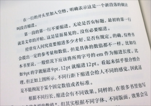
Japanese
It is a 1-character indent. Unlike Western text, it is common to indent the first paragraph as well. I don't think indentation is necessary when there is spacing between paragraphs.
Chinese
It is a 2-character indent. Unlike Western text, the first paragraph is also indented. Personally, I think that if there is spacing between paragraphs, indentation is unnecessary, but in practice, there are quite a few typeset with a 2-character indent. It seems that a 1-character indent in Japanese appears very awkward to Chinese readers, and it is said that it is better not to indent at all than to use a 1-character indent. When typesetting in Chinese, let's switch our mindset from the Japanese perspective.
Main Reference Materials
Nigel French, InDesign Type: Professional Typography with Adobe InDesign (3rd edition), 2014
Masao Takaoka, "Revised and Expanded Edition of Basics and Manners of Western Typesetting Typography," Uyu Shorin, 2019
Liu Qing "ABC3 of Chinese Typography and Typesetting" TypeTalks No. 37 (Seminar), 2016
>>Related Materials: Post-Edit Quality Check Sheet Download