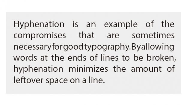
What do you think of this layout?
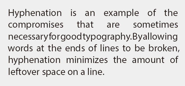
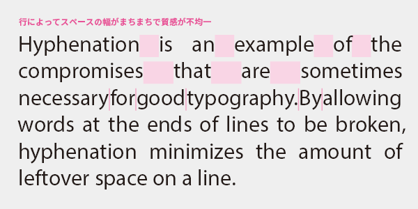
There are lines with too much space that look like they have holes eaten by insects, and there are lines with too little space where words are stuck together. When the quality of typesetting is uneven like this, it disrupts the reading rhythm and makes it difficult to read. How can we achieve uniform typesetting?
Stretching and adjusting letter spacing is not acceptable. Adjusting only the space width is not sufficient. Well?
Table of Contents
Hyphenation is essential for justified text
Hyphenation is necessary even for head alignment
Application: The merits and demerits of applying Japanese composition to Western text
>>Translation Services from Human Science, a Localization Company
>>Related Download Materials: 9 Examples of Machine Translation Errors and Post-Editing & Post-Editing Checklist
Disadvantages
Improvement Proposals
Hyphenation is essential for justified text
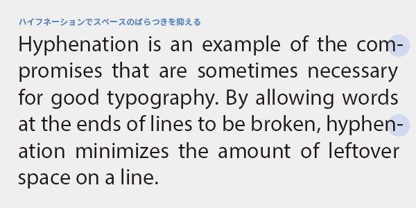
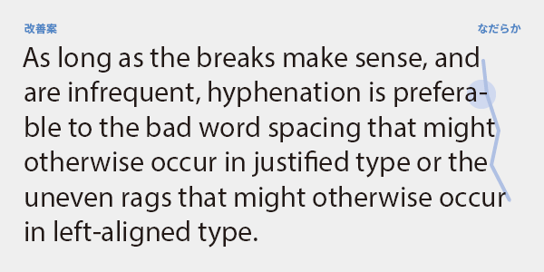
Hyphenation is the process of splitting words at the end of a line with a hyphen to improve the formatting of the text. In justified text, the width of spaces is adjusted to align the lines, which can sometimes result in large gaps between lines. By using hyphenation, the variation in space width between lines can be minimized.
In principle, hyphenation should be applied to the text. It is almost impossible to achieve a well-balanced layout without it, and if the spacing varies, the typesetting will look poor, making it difficult for natives to read. Let's not hesitate to use hyphenation, as it will result in a uniform texture and an easy-to-read layout.
The reason for saying "without hesitation" is that there are quite a few Japanese people who tend to avoid it because they are not well acquainted with hyphenation. In DTP, it is processed automatically based on the built-in dictionary, so it will not be split at odd places, and words that are not in the dictionary will not be split arbitrarily. Since this is a feature included to make Western typesetting more convenient, let's make sure to utilize it.
Hyphenation is a basic knowledge level taught in elementary school language classes for locals. Instead of fearing hyphenation, fear the creation of difficult-to-read and poorly typeset documents.
Hyphenation is necessary even for head alignment
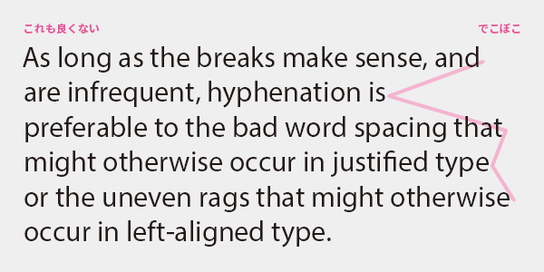
Some people believe that hyphenation is unnecessary when justifying text, but this is a big mistake. In justified text, the line length varies from line to line, and if long words at the end of a line are broken early, it can create large gaps at the end of the lines, disrupting the flow of reading and making it difficult to read. Additionally, short lines can be confused with the end of a paragraph. To prevent these issues, hyphenation is essential.
Hyphenation Etiquette
・Do not split proper nouns
- Do not split the last word of a paragraph or words that span across pages or sections
- Leave at least 3 characters before and after the hyphen
・At most, it can be up to 3 lines
・Headings and captions should not be hyphenated
Paragraphs that are center-aligned or justified will not have hyphenation.
・Compound phrases connected by hyphens, such as 'software-as-a-service', should be split at the position of the hyphen without unnecessarily increasing the number of hyphens.
・Be careful that the split counterpart does not unexpectedly become vulgar language
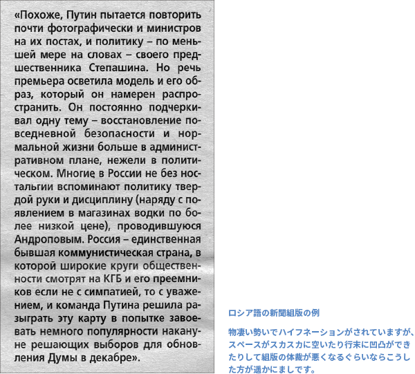
However, these are merely principles, and when manners and readability do not coexist, the latter may take precedence. In cases of narrow line widths, hyphenation may occur for more than three lines in a row, and sometimes even proper nouns may be hyphenated, but this is a reasonable compromise to maintain the formatting of the typesetting. There is no need to unify standards across multiple languages; for example, when typesetting languages that tend to have long words, such as German, Dutch, or Russian, the frequency of hyphenation will be increased compared to English.
Application: The merits and demerits of applying Japanese composition to Western text
Just because Japanese text is justified, should we indiscriminately apply the same to Western text? Japanese characters fit naturally into square spaces of the same size, making justification easier, while Western text does not justify naturally due to varying word widths. The ratio of justified to left-aligned text in publications seems to be about 9 to 1 for Japanese and roughly 50-50 for Western text. When expanding from Japanese to English or other languages, shouldn't we consider changing to a more appropriate layout?
Justified (both aligned and box layout)
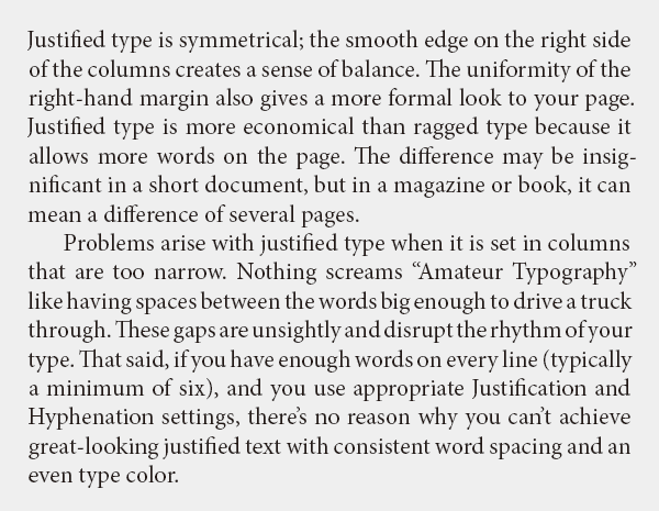
Justified alignment refers to a typesetting method that aligns the beginning and end of lines by adjusting the width of spaces. Since the line lengths are uniform, it allows for a consistent rhythm while reading, making it suitable for book text. It is typically used only for body text, while headings, tables of contents, captions, footnotes, and indexes are set with left alignment.
Alignment (Left alignment (Right alignment for RTL languages) and ragged edges)
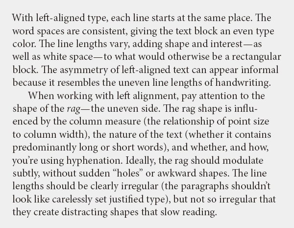
Justification refers to the method of aligning text by simply arranging characters from the beginning of the line and wrapping to the next line when reaching the end. The space width remains constant and does not stretch, resulting in a beautiful layout with a uniform texture. It has a modern impression and is commonly used overseas. This method is applicable to various media, not just books.
>>Translation Services from Human Science, a Localization Company
>>Related Download Materials: 9 Examples of Machine Translation Errors and Post-Editing & Post-Editing Checklist
Main Reference Materials
Nigel French, InDesign Type: Professional Typography with Adobe InDesign (3rd edition), 2014
Cyrus Highsmith, "The Fundamentals of Typography" Graphic-sha, 2014
Masao Takaoka, "Revised and Expanded Edition: The Basics and Manners of Western Typesetting" Uyu Shorin, 2019