What do you think of this layout?
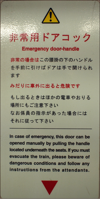
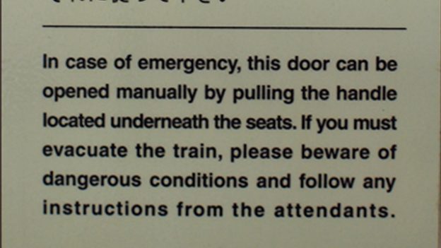
There are often plates like this posted next to train doors. This Western typography is very difficult to read, so it needs to be corrected. How should it be corrected and in what way?
Table of Contents
Do not change the spacing of the text
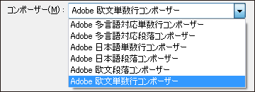
The reason is that English was configured while the settings were still in Japanese.
>>Translation Services from Human Science, a Localization Company
>>Related Materials: Nine Cases of Machine Translation Errors and Post-Editing & Post-Editing Checklist
Disadvantages
Improvement Proposals
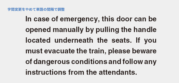
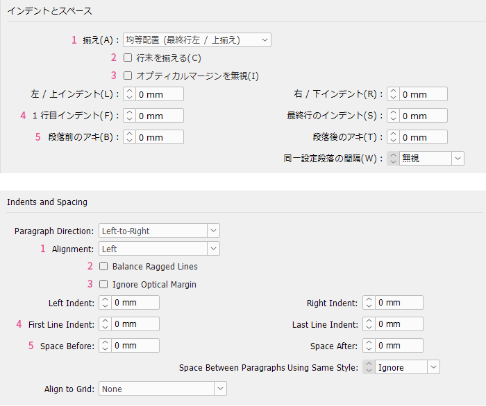
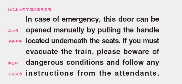
Do not change the spacing of the text
The spacing between characters varies greatly by line, resulting in a rather uneven quality of typesetting. Additionally, changing the character spacing can distort the outlines of words, leading to a situation where the same word appears differently in shape from line to line due to inconsistent spacing. Both of these issues are very unnatural and difficult to read for native speakers.
Generally, you should not change the letter spacing. Font designers do not only design the shapes of the letters. They pay close attention to adjusting the letter spacing to ensure that the letters are easily recognizable when arranged into words.
In the improvement plan, we stopped changing the letter spacing and adjusted the width by stretching and compressing the space between words. This is a standard practice in typesetting. This helps avoid changes in the shape of words from line to line. Since it is difficult to justify the last line, we aligned it to the left. I believe the typesetting has become more uniform and easier to read.
Due to its mechanism, changing the letter spacing line by line in letterpress is incredibly cumbersome, and tightening the letter spacing is impossible. The fundamentals of typesetting were established during the letterpress era, so typesetting that is not done or cannot be done with movable type may cause readers to feel discomfort or difficulty in reading. When you are unsure about typesetting or feel a sense of discomfort, imagining how it would be arranged in letterpress is beneficial even in the DTP era.
The reason is that English was configured while the settings were still in Japanese.
The cause of this error is likely the composer settings. When flowing Western text with justified alignment using a Japanese composer, the letter spacing varies by line, resulting in a layout that feels awkward to native speakers. It is necessary to change the settings to the appropriate composer for the language, such as using a Western composer for Western text and a multilingual composer for Arabic or Thai work.
Inappropriate data in a composer is like building a Western-style mansion on the foundation of a traditional Japanese house. Not only does it look mismatched, but it is also likely to tilt or collapse soon. Differences in composers can be hard to notice without a keen eye for typesetting, and when corrections are needed, it often requires major renovations from the foundation up, making it difficult to propose improvements. It's easier to suggest changes for things like quotation marks and capital letters, where the correctness is clear to everyone, corrections are simple, and the results are immediately obvious...
For example, in Japanese
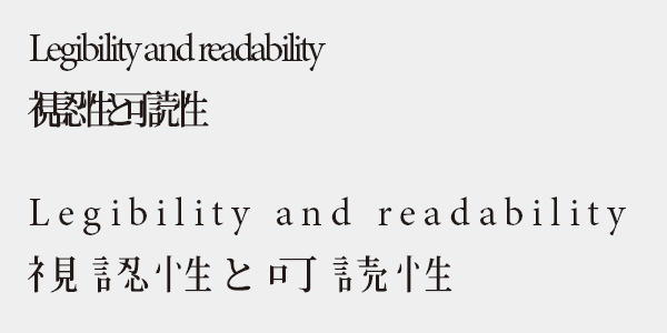
No one is going to approve this typesetting, right? It is not an exaggeration to say that changing the letter spacing distorts the shape of the words, causing the radicals of the kanji to scatter. It is neither visually accessible nor readable.
Exceptions where changes to letter spacing are permitted
In principle, the letter spacing should not be changed, but it is permissible to make modest adjustments to a degree that does not cause discomfort to the reader, only in cases of valid reasons. The letter spacing of the font is designed based on the lowercase letters of the normal body size, but this applies when used in other contexts.
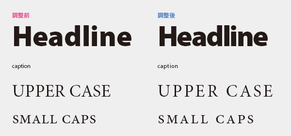
Large text such as headings: When the font size is large, the spacing between letters can appear uneven, making it slightly slower for the eyes to recognize words. It is advisable to tighten the letter spacing slightly.
Small text such as captions: When the font size is small, it can be difficult to read, so adding a slight margin around the text can make it easier to distinguish.
Uppercase, small caps: Since the letter spacing tends to be tight, it is advisable to widen it slightly.
>>Translation Services from Human Science, a Localization Company
>>Related Materials: Nine Cases of Machine Translation Errors and Post-Editing & Post-Editing Checklist
Main Reference Materials
Masao Takaoka, "Revised and Expanded Edition: Basics and Manners of Western Typesetting Typography," Uyu Shorin, 2019
Masao Takaoka, "ABC of Western Typesetting: Intermediate Edition," TypeTalks Subcommittee (Course), 2015
Cyrus Highsmith, "Basics of Western Typography," Graphic-sha, 2014