What do you think of this layout?
I find this layout very difficult to read, so I would like to redo it. There are capitalized words and inconsistencies in the number of characters per line, but the problem is more fundamental. How should I go about making corrections?
Table of Contents
>>Translation Services from Human Science, a Localization Company
>>Related Materials: Nine Cases of Machine Translation Errors and Post-Editing & Post-Editing Checklist
Disadvantages
Improvement Proposals
Do not set Western text in Japanese fonts
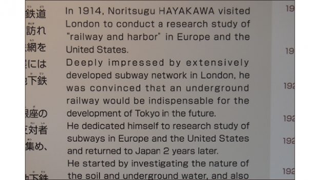
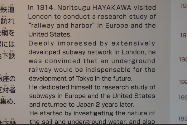
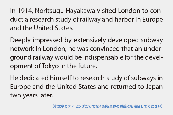
The reason this typesetting is difficult to read is that it is set in a Japanese font. The alphanumeric characters that accompany Japanese fonts are called subordinate Latin characters, and they are designed to blend in with Japanese text when a few Latin characters, such as in "Mr. A" or "PCR test," are mixed in. They are not designed for typesetting Latin text. The shapes are distorted, there is no italic, and there is an indescribable sense of discomfort throughout the typesetting. For Latin typesetting, let's use a Latin font instead of subordinate Latin characters.
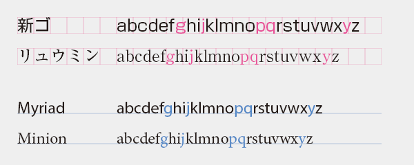
The cause of distorted letterforms dates back to the era of phototypesetting. Due to the limitations of phototypesetting machines, characters could not extend beyond the virtual body (the frame that holds the letters ≒ grid), resulting in a squeeze towards the descender (the part that extends below the baseline in lowercase letters). The letter g becomes squished, p and q are truncated, and j and y bend to the left instead of extending downward, causing the letters to deform and become harder to read. The deformation of letters leads to the collapse of the contours of words, making them increasingly difficult to read.
When looking at the overall layout, it becomes clear that there are variations in the whites and blacks. This is because the subordinate Latin text is not designed with the assumption of composing Latin text, so adjustments to the design of the characters and letter spacing are not made. A layout with uniform texture is pleasant to read, but when composed with subordinate Latin text, the texture becomes uneven, disrupting the reading rhythm and making it harder to read.
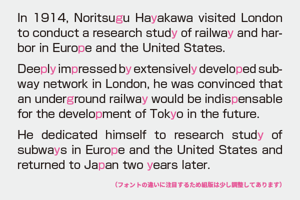
The subordinate Latin characters of Japanese fonts, which have continued since the era of phototypesetting, face the same issues. Fonts developed from the beginning as digital fonts may be somewhat better, but the premise of using them mixed with Japanese characters remains unchanged. When composing Latin text, let's use proper Latin fonts.
For example, in Japanese
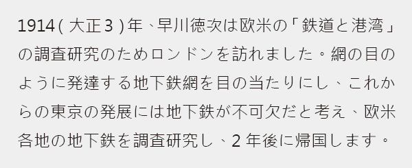
I tried composing Japanese text using a Chinese font. Anyone who is Japanese would likely feel a sense of discomfort. There are unfamiliar kanji characters here and there, the placement of punctuation is strange, and the design of the hiragana is quite clumsy. While it might be possible to read it if one tries, did you have a good impression upon seeing this? The sense of discomfort may have hindered your ability to absorb the content smoothly.
>>Translation Services from Human Science, a Localization Company
>>Related Materials: Nine Cases of Machine Translation Errors and Post-Editing & Post-Editing Checklist
Main Reference Materials
Robert Bringhurst, The Elements of Typographic Style (4th ed.), 2012
Masao Takaoka "ABC of Western Typesetting (Phase 3)" TypeTalks Subcommittee (Seminar), 2015
Seiko Makikura "Common Sense and Nonsense of Western Typesetting in Japan? Typography in Japan from a European Perspective" TypeTalks 29th (Seminar), 2015