What do you think of this layout?
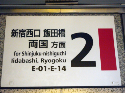
This signboard poses no problem for Japanese people. Foreigners who rely on station numbering and are unfamiliar with the area might hesitate for a moment. There is room for improvement in this layout, but where and how should it be corrected?
>>Translation Services from Human Science, a Localization Company
>>Related Download Materials: Nine Cases of Machine Translation Errors and Post-Editing & Post-Editing Checklist
Dashes Indicating Range or Duration
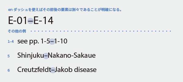
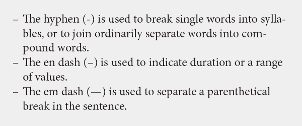
When indicating ranges such as years and months, time, places, or numbers, use an en dash (–) without spaces. The en dash is slightly longer than a hyphen and serves a different purpose, so it must be distinguished. Even if another symbol is used in the text manuscript, it should not be left as is during typesetting but replaced with the correct dash.
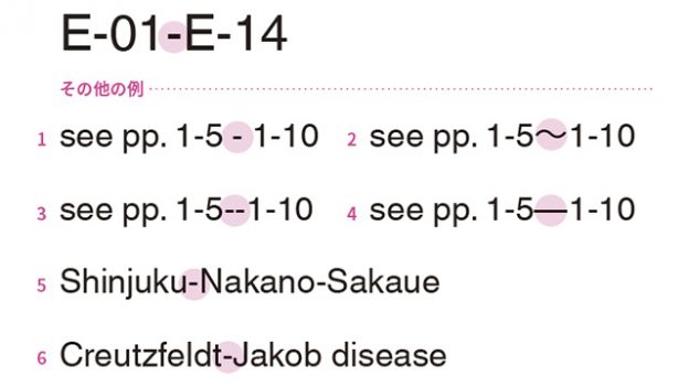
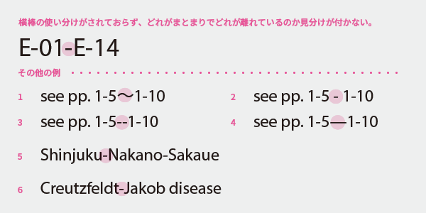
Other examples:
1 The wave dash (~) is a Japanese symbol and is not used in Western text.
2 Adding spaces before and after a hyphen may be a remnant from the typewriter era when dashes could not be typed.
3 This is also a remnant from the typewriter era, but using two hyphens results in replacement with an em dash, which is a double mistake.
4 is a symbol known as an em dash, which has a different role. English does not use the em dash in this context.
All of these are inappropriate, and replacing them with an en dash is appropriate. Connecting multiple elements with a hyphen makes them a single unit, but connecting them with an en dash makes it clear that they are separate items.
5 If a foreigner unfamiliar with Tokyo place names sees this, it is unclear whether it is a long station name "Shinjuku Nakano Sakaue" or the three stations "Shinjuku—Nakano—Sakaue." Writing it as in the suggested improvement clearly conveys that it is the section between Shinjuku and Nakano Sakaue.
6 The same applies to personal names: connecting with a hyphen refers to a single person named Creutzfeldt-Jakob, while connecting with an en dash refers to a disease named after two individuals, Creutzfeldt and Jakob. Of course, the latter is correct.
In fact, if numbers and place names are connected by some kind of horizontal line, I think people can infer the meaning from the context, but there is still room for misunderstanding. By using symbols accurately, the distinction between "cohesion" and "separation" can be immediately recognized, eliminating any possibility of misunderstanding. Just a little consideration for typesetting can change how the message is conveyed.
In Languages Other Than English
European languages generally use the en dash just like English, but there are languages that do not. Instead of blindly unifying with English, use the appropriate symbols for each language. In Japanese, the wave dash tends to be used, but it is not uncommon to use the full-width dash (—) or the en dash (–) as well.
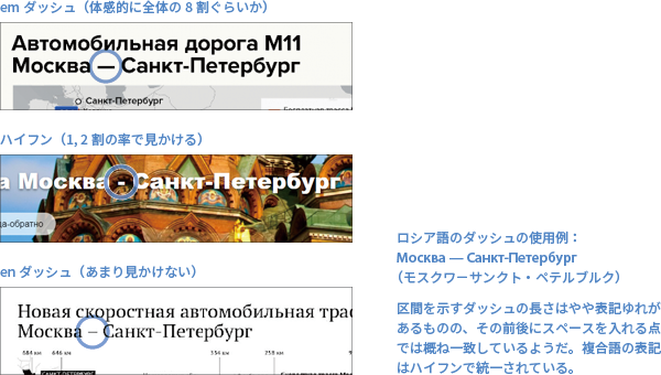
In Russian, the distinction between dashes seems to be ambiguous. The most commonly seen is the em dash (with spaces before and after), but hyphens and en dashes are also occasionally seen. This is not limited to Russian; there are many languages where typesetting rules are unclear or, even if there are supposed rules, they are loose and the correct usage is not clear. In such cases, it is best to accept that consistency within a single work is what matters.
Dashes for Breaking the Flow of Text
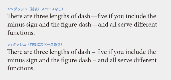
Dashes are also used when you want to break the flow of a sentence or take a brief pause. The common usage is to use an em dash (–) without spaces on either side, or an en dash with spaces on both sides.
Dashes for Bullet Points
Bullet points are often created using bullets (•), but en dashes can also be used. Occasionally, you may see bullet points made with hyphens, but since they are short and not very noticeable, dashes that are clearly recognizable at a glance are recommended.
Main Reference Materials
Butterick’s Practical Typography (
https://practicaltypography.com/hyphens-and-dashes.html)
Nigel French, InDesign Type: Professional Typography with Adobe InDesign (3rd edition), 2014
Akira Kobayashi, 『Western Typefaces: Their Background and Usage』, Bijutsu Shuppansha, 2005
>>Translation Services from Human Science, a Localization Company
>>Related Download Materials: Nine Cases of Machine Translation Errors and Post-Editing & Post-Editing Checklist