What do you think of this layout?
This is not a correction of characters or symbols. The layout is overall a bit difficult to read, so I would like to redesign it to make it more readable. Where would you improve it?
Table of Contents
Disadvantages
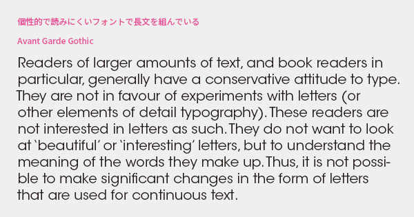
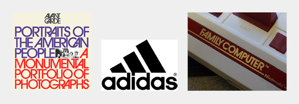
This typesetting uses the Avant Garde Gothic font. The circles are almost perfect geometric sans-serif shapes, and as the name suggests, it is an avant-garde and futuristic impression font suitable for headings. It is very effective when used for "display items" such as advertisements, packaging, and logos.
On the other hand, it is not suitable for "reading materials" such as books, articles, and manuals. The difference in density between the round spaces and the closely packed vertical lines is noticeable, disrupting the reading rhythm. While distinctive fonts can leave a strong impression, their peculiarities can be off-putting, making it difficult to absorb the content. It also borders on amateur design that lacks grounding. Readers do not want to see interesting characters; they want to understand the meaning of the text.
Improvement Proposals
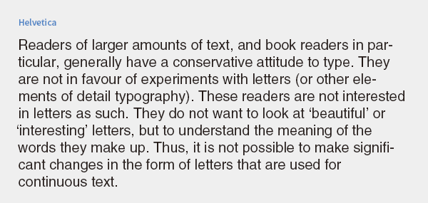
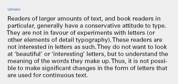
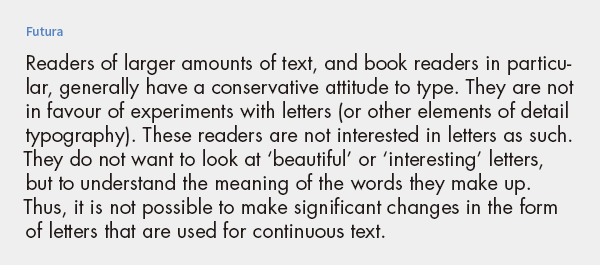
We will consider changing to a font suitable for long texts that does not interfere with reading. When it comes to sans-serif fonts that are neutral, Helvetica is the first choice. If prioritizing readability, Univers with its spacious letter spacing is a good option, and if you want to maintain a geometric impression, Futura may also be a good choice.
To choose the optimal font, it is necessary to consider not only the content of the text and the purpose of communication but also the font designer's intent—what kind of situations and how the font is expected to be used. It is meaningless to prioritize appearance over readability or to insist on selfish preferences while neglecting the appropriate use of fonts.
Isn't there anything else besides the standard fonts?
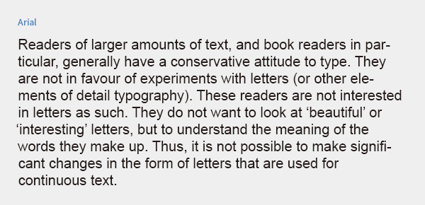
The most commonly used font for external data brought in for translation is Arial. However, the reason for choosing it is not necessarily because it is easy to read. It is likely because it resembles Helvetica, is available on all PCs without needing to purchase it separately, and has a wide range of multilingual glyphs that are versatile. There are certainly creators who prefer not to use it due to its background, but there are no practical issues.
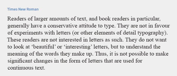
The next most common is Times New Roman. Originally a newspaper typeface, it has a sturdy and bold serif design to ensure that the type does not break during high-volume printing on a rotary press, maintaining readability even if the ink smudges slightly. It embodies a sense of practicality and robustness, being unrelated to elegance or luxury. Like Arial, it is available on all PCs and supports a wide range of multilingual glyphs.
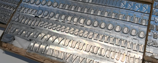
Metal type of Times New Roman
It may be easy for the creator to rely on just these two options, but it lacks variety, and one might wonder if they are really that good of a font. Moreover, if used in the wrong context, readers may feel a sense of discomfort. While it may work for manuals, it is not suitable for advertisements, and although it can be used for official documents, it is not appropriate for high-end brand catalogs. I think it's a waste to choose fonts out of habit.
While leaving the choice of a special font to the designer, is there a standard font for everyday use that we can consider?
Alternative Plan
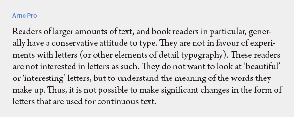
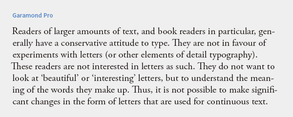
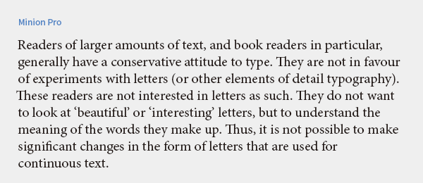
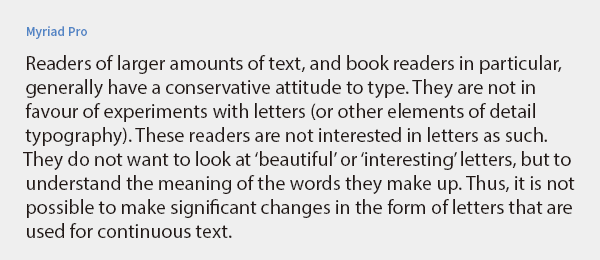
When considering the condition of a standard font that can be used in multiple languages without additional costs, the fonts provided by Adobe Fonts are one option. For example, Arno, Garamond, and Minion are all standard fonts that are easy to read and suitable for book typesetting. For sans-serif, Myriad offers a wide variety and is user-friendly. All of these cover not only various Western languages but also Vietnamese, Russian, and Greek.
In addition, while they are familiar to everyone and lack a sense of uniqueness, you may find fonts that suit your needs among the bundled fonts of OS and Office products. Of course, if you invest in fonts, your options will greatly expand.
Font Selection Criteria
Is it suitable for the purpose?
Is the content of the text, the image of the product or customer, and the method/media of conveying them appropriate?
Usage for reading: Is the readability high? Can it be read smoothly without any obstacles? Is the font like a colorless, transparent air that does not make the reader aware of its presence?
Usage for display: Is the legibility high? Does it catch people's attention at a glance? Can it leave a strong impression at first sight? Can it be read from a distance?
Assemble long sentences and check for any awkwardness
Even if the font has a beautiful shape, there are some fonts that do not feel right when composing long texts. Instead of deciding just by looking at the font samples, let's carefully examine the composition samples as well.
Are there variations in thickness and character width?
Using a single font family can create a sense of unity.
Is the quality of the italic good?
There are surprisingly cases where the Roman type is good, but the italic is not so great.
Are the necessary glyphs in place?
For example:
・Are the necessary diacritical marks for the language available?
・Are Greek and Cyrillic characters included?
・Can Arabic and Persian be combined in one font?
・Are all the necessary symbols available?
・What about ligatures, small caps, and old-style numbers?
etc.
Others
How compatible is it with other fonts used in combination?
Is the price reasonable? Are you overlooking the above points because of being lured by the "free" offer?
Main Reference Materials
Jost Hochuli, Detail in typography, Éditions B42, 2015
Robert Bringhurst, The Elements of Typographic Style (4th ed.), 2012
Simon Garfield, "My Favorite Type: A Talk About Fonts" BNN New Media, 2020
Masao Takaoka "ABC of Western Typography (Phase 3)" TypeTalks Subcommittee (Seminar), 2015
>>Related Materials: Post-Edit Quality Check Sheet Download