What do you think of this layout?

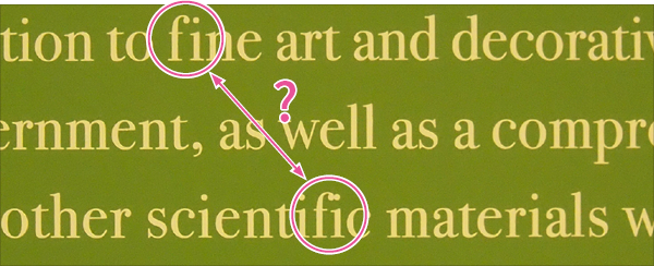
It may be surprising, but you can often see strange typesetting in museums and art galleries. Descriptions of exhibits are usually accompanied by English, but the typesetting is often poor. The figure is an example of a basic typesetting error from the Tokyo National Museum. How should it be corrected?
Table of Contents
It is mandatory to use ligatures in Latin script
Disadvantages
Improvement Proposals
It is mandatory to use ligatures in Latin script
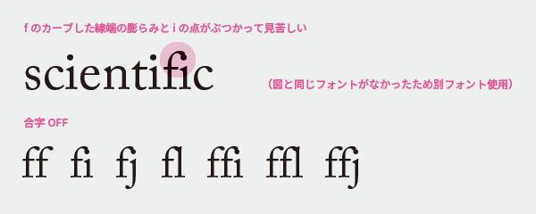
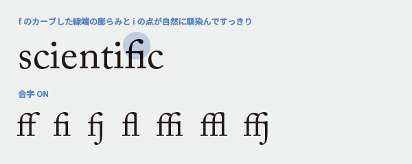
To avoid awkward connections between characters, two or more characters combined into one are called ligatures. A ligature that beautifully connects the lowercase 'f' with the following character is specifically referred to as an 'f ligature.' Using f ligatures has been the typesetter's duty since the era of letterpress printing, and failing to use them is considered an error.
Let's see what happens if we don't use the f ligature. In a poor example, the curved end of the f collides carelessly with the next character, and the junction looks messy and unsightly. By using the f ligature, the junction blends in naturally.
Even without using ligatures, the text itself is readable. There is no need to worry about this in everyday email content or Word documents. However, in the world of typesetting, the use of ligatures is one of the minimum conditions that must be met, and the option to not use them when they are available is not acceptable. There are design competitions that may disqualify entries based on whether ligatures and the quotation marks explained earlier are used correctly, so it is better not to dismiss this as a trivial detail.
Multilingual Typesetting Notes: Quotation Marks
Using ligatures in DTP is easy. InDesign and Illustrator have a feature that automatically switches the glyphs to ligatures when the characters that should be ligatured are lined up. On the other hand, it seems that FrameMaker does not have such a feature. Perhaps it is because it is positioned more as a professional word processor than DTP.

In designs with sans-serif fonts, there may be little noticeable difference in appearance whether or not there is an f ligature.
There are also optional ligatures

Depending on the font, there may be ligatures other than the f ligature, but whether to use them is optional. These ligatures are more decorative than readable, and while they might be interesting to try in book typesetting, they may be inappropriate for technical documents.
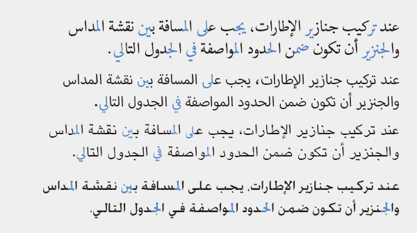
In cases other than Western languages - Arabic
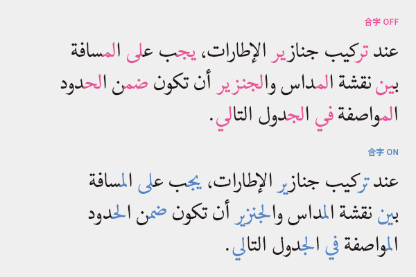
In addition to Latin characters, ligatures exist, and their structure and effect vary by language. Arabic ligatures take the form of handwritten strokes reproduced in typesetting. They are commonly used in all media, including books and newspapers, and everyone reads them without feeling any discomfort, so if the situation allows for ligatures, let's use them without hesitation.
There are some documents that exceptionally do not use ligatures, such as children's books and introductory books on Arabic. This is intentionally done for readers who are just learning to read and are not familiar with ligatures. If ligatures are not used in documents intended for adults, it may seem awkward and could create a sense of discomfort for the readers.
It doesn't matter if the ligatures differ depending on the font.
This is the same text composed in four different fonts. Since the ligatures included vary by font, the same word may appear differently. It might be unsettling if you are not aware of this, but to native speakers, it looks the same, so there is no problem.
For example, in Japanese

Not using ligatures is like separating the voiced sound marks from the base characters. I don't think anyone would approve of this typesetting.
Actually, this is not good either
It may be unnecessary to mention, but if you look closely, you can see that the spacing between characters varies by line. Such typesetting is unnatural and difficult to read, and if the same word appears in different forms on different lines, it creates a significant sense of discomfort.
Multilingual Typesetting Note: Do not change the spacing between characters
Main Reference Materials
Akira Kobayashi, 『Western Typefaces: Their Background and Usage』, Bijutsu Shuppansha, 2005
Masao Takaoka, "Revised and Expanded Edition of Basics and Manners of Western Typesetting Typography," Uyu Shorin, 2019
>>Related Materials: Post-Edit Quality Check Sheet Download