What do you think of this layout?
This layout is difficult to read and the content is hard to grasp, so I would like to make some corrections. Where and how should I make the corrections?
Table of Contents
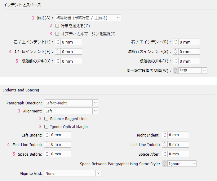
English has narrower line spacing than Japanese
>>Translation Services from Human Science, a Localization Company
>>Related Materials: Nine Cases of Machine Translation Errors and Post-Editing & Post-Editing Checklist
Disadvantages
Improvement Proposals
English has narrower line spacing than Japanese
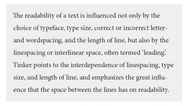
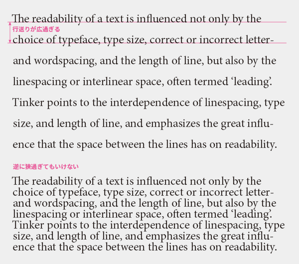
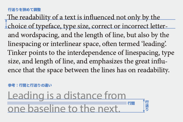
Line spacing greatly affects the readability of text. Just like letter spacing and word spacing, there is a balance in line spacing that should not be too wide or too narrow, but this example is too wide. When the line spacing is too wide, it appears scattered and makes it difficult to gather thoughts for the next line. It also resembles a textbook (which has wide line spacing for writing), making it unsuitable for the purpose of engaging native readers.
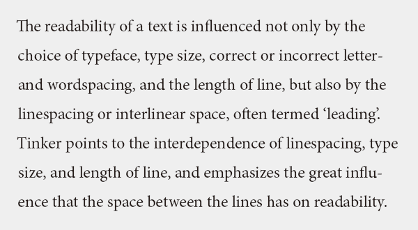
On the other hand, if the line spacing is too narrow, it is also problematic. It can become difficult to tell which line you are reading, and you may get confused when moving to the next line or end up reading the same line again. It is unacceptable for the text above and below to collide.
For standard Western fonts, it is advisable to start adjusting the line spacing at around 120% of the font size. If you are unsure about the adjustment, it is recommended to make it narrower. It seems that Japanese people tend to unconsciously set wider line spacing.
The optimal line spacing is influenced by conditions such as font and column width, so it is unreasonable to set it uniformly, such as "XX font is 10pt/12pt." When the column width is narrow, like in newspapers, the movement of the gaze is reduced, so line spacing is not as necessary. Conversely, when the column width is wide, it is better to have wider line spacing to avoid losing track of the section being read.
Have you ever had the experience where, despite the text not being difficult, you just can't seem to grasp the content? It might not be an issue of your comprehension or concentration, but rather a problem with the typesetting; perhaps the spacing between lines, words, and characters is not properly adjusted.
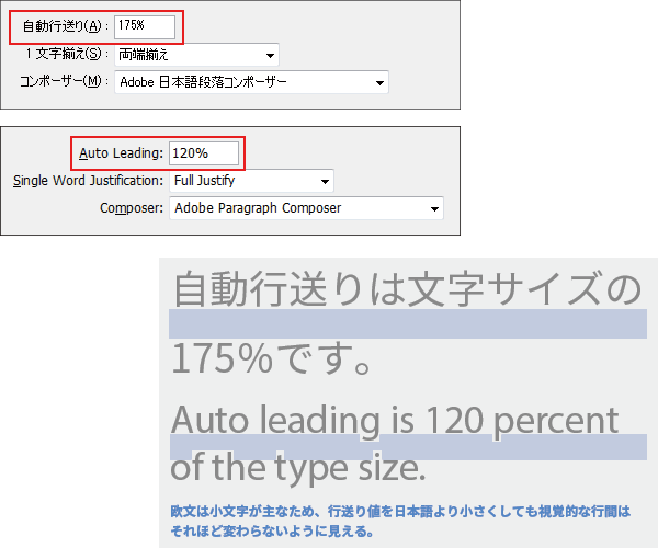
The default value for automatic line spacing in InDesign varies by language, with a significant difference between the Japanese version at 175% and the English version at 120%. In many cases, if you flow Western text into the line spacing set for Japanese data, it becomes too wide. Always narrow the line spacing when expanding from Japanese to Western text. Even in Japanese-Western parallel text, do not align the line spacing; Western text needs to be adjusted to a line spacing that is easy to read as Western text.
When expanding into multiple languages
Latin text with many diacritical marks (auxiliary symbols)

In the case of Eastern European languages and Vietnamese, which have many diacritical marks, it is often cramped with the same line spacing as English, so it is advisable to adjust it slightly wider.
Arabic characters
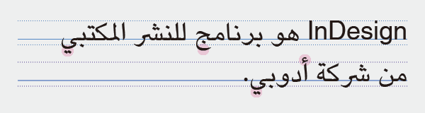
The pink highlights indicate the areas where Arabic characters extend beyond the upper and lower bounds of lowercase Latin letters. It is evident that Arabic characters are taller than Latin characters. Since there is a risk of the characters colliding with each other at the same line spacing as English, it is necessary to increase the spacing. Depending on the font, the baseline of Arabic and Latin characters may not align, or the size balance may be poor. These adjustments are also necessary.
Thai characters

Thai characters can be tall, and pronunciation symbols may stack vertically, so I think it's better to allow for extra line spacing. Depending on the font, the character size may be noticeably smaller than Latin characters at the same point size, and overall adjustments may be necessary.
Blank Hierarchy
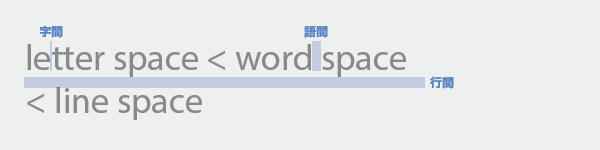
The width of the whitespace in typesetting is letter spacing
If you have a good body font, the correct spacing between letters and words can be achieved without any special adjustments. The line spacing is up to the designer's judgment, but the optimal line spacing varies depending on the language, width of the text, and font, so it should be determined each time. Adjusting the line spacing to match Japanese or English without careful consideration is more harmful than beneficial.
>>Translation Services from Human Science, a Localization Company
>>Related Materials: Nine Cases of Machine Translation Errors and Post-Editing & Post-Editing Checklist
Main Reference Materials
Jost Hochuli, Detail in typography, Éditions B42, 2015
Cyrus Highsmith, "Fundamentals of Western Typography", Graphic-sha, 2014
Masao Takaoka, "Revised and Expanded Edition: The Basics and Manners of Western Typesetting", Uyu Shorin, 2019