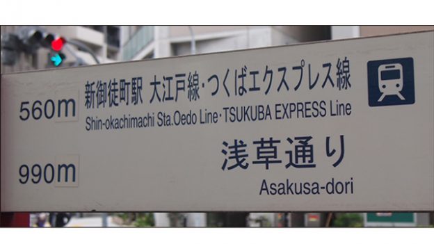
What do you think of this layout?
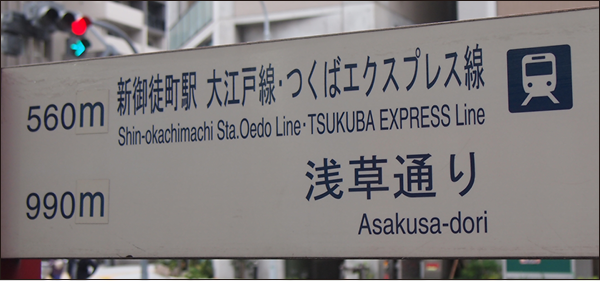
When trying to cram text into a limited space, this is often the result. There is much room for improvement in the layout of this signboard. How should we modify it and in what way?
Table of Contents
>>Translation Services from Human Science, a Localization Company
>>Related Materials: Post-Edit Quality Check Sheet Download
Disadvantages

Improvement Proposals
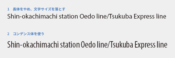
Avoid elongation as much as possible
The process of narrowing the width of characters is called "elongation." Since font design is a culmination of craftsmanship, distorting it would ruin its quality. The more the balance of line thickness is disrupted, the lower the visibility becomes, and it can also appear as a careless, haphazard job. Thinking that elongation is a quick way to fit text into limited space is absolutely unacceptable. We should avoid character distortion as much as possible.
First, let's stop using extended typefaces. Naturally, it will overflow as it is, so you need to reduce the font size to fit within the space, but don't you think it has become much more readable (1)? As a second-best option, there is the choice of using condensed typefaces (2). They are designed to have a narrow width from the beginning and do not significantly compromise visibility.
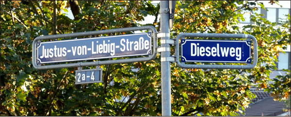
Photo: http://t-director.exblog.jp/24601588/
The fundamental solution is to increase the size of the signs. Priority should be given to visibility, and the signs should be deformed rather than the text. The photo above is an example from Germany, where they do not cram text into a fixed-size board. Instead, they change the size of the signs according to the amount of text.
Increased volume is a given in translation
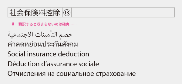
In Japanese-English translation and English to multilingual translation, it is often the case that the amount of text increases. To ensure that the translated version is also easy to read, let's allow for some extra space in the source language version. Be cautious if phrases in captions or tables fit tightly in a narrow space without gaps. They will likely not fit after translation.
Hmm... (speechless). It seems that there was only a focus on fitting the translation into the framework, without any consideration for readability. When it gets this extreme, there isn't much that can be improved through typesetting. We will have no choice but to shorten the text, focusing only on the information that truly needs translation.
>>Translation Services from Human Science, a Localization Company
>>Related Materials: Post-Edit Quality Check Sheet Download
Main Reference Materials
Akira Kobayashi "Thoughts on Public Signage (1) Make Vertical Lines Thicker than Horizontal Lines, the Basics of Western Design" Type Director's Eye (https://t-director.exblog.jp/24599522/)
Akira Kobayashi "Thoughts on Public Signage (2) Delivering Information as It Is" Type Director's Eye (https://t-director.exblog.jp/24601588/)
Seiko Mukai "Beautiful Books and Typesetting in Europe: Insights from a Typographer Living in Germany" TypeTalks No. 35 (Seminar), 2016
>>Related Download Materials: Nine Cases of Machine Translation Errors and Post-Editing & Post-Editing Checklist