What do you think of this layout?
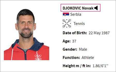

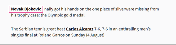
At an international competition, tennis player Novak Djokovic achieved a Golden Slam. The player list shows "DJOKOVIC Novak," the article headline states "NOVAK DJOKOVIC," and the body of the article refers to him as "Novak Djokovic." The representations of his name vary. Should these be standardized? If so, which version do you think is best to standardize to?
Table of Contents
In this case, it is better not to unify.
Example 1 of Blind Unification: Logo and Body Text
In this case, it is better not to unify.
There is no problem at all with the current situation. This is the result of appropriate differentiation rather than inconsistency. The player list primarily references last names, so the last names are capitalized and the word order is rearranged to the front. Since the headings need to stand out, they are in all capital letters, while in the article body, only the first letter of proper nouns is capitalized. Since there is a smart differentiation in use, there is no need to unify it unnecessarily.
If you don't realize such things, you may start to notice inconsistencies and feel compelled to unify everything without thought. Let's take a deep breath and calm those obsessive thoughts. And how about consciously taking your time to cultivate your eye for typesetting?
Example 1 of Blind Unification: Logo and Body Text
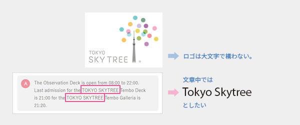
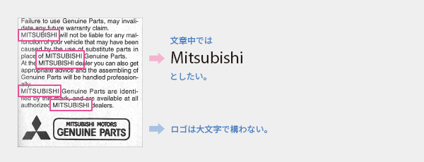
In a previous article titled "Multilingual Typesetting Notes: Avoiding Uppercase Letters," I explained that the purpose of the text is not to reproduce the logo but to convey information. Therefore, even if the logo is in uppercase, it should be revised to standard notation within the text. Forcing uniformity in notation can compromise readability and should be avoided as it may look unappealing.
Example 2 of Blind Unification: Abuse of Abbreviations

The "Sta." on the right is presumably intended as an abbreviation for Station, but using a period does not mean that abbreviations can be freely created. It feels awkward because it is not a common notation. Is this an unavoidable measure due to the limited space?
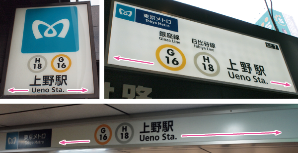
Oh dear? There's quite a bit of whitespace... Looking at this, it becomes clear that it was not an "inevitable measure." It seems that the translation term was set as "Station = Sta." and thus, without considering the presence or absence of space, it was uniformly standardized to "Sta." in a rigid manner. When there is enough space, it should be written out as "Station" without abbreviation. Even when space is limited, it is more considerate to reduce the font size and keep it full rather than forcibly using a mysterious abbreviation.
Now, how about elsewhere? Let's go take a look.

Keisei trains are fine. JR is also fine.

There were no issues with the former National Railways. Is your local station okay?
Who are the rules for?
Arbitrary standardization of notation is one of the traps that people who want to believe that "as long as there are rules for typesetting, there will be no mistakes" tend to fall into. The purpose of typesetting is to achieve readability and visibility for the user, while the purpose of the rules is merely for the convenience of quality control on the creator's side. When the two are difficult to reconcile, prioritizing rules over readability is counterproductive.
There are many issues in typesetting that cannot be simply categorized as right or wrong. In this article, ambiguous expressions such as smart, readability, unsightly, discomfort, and helpfulness have appeared. The optimal typesetting varies depending on the situation, so we want to approach each case with appropriate consideration and etiquette.
Main Reference Materials
Mari Tashiro, Akira Kobayashi "How to Organize English Information for Effective Communication with Readers" Type& 2015 (Lecture), 2015
Hiroyuki Honda, Kazunari Iwata, Hideo Kurabayashi 'Inspecting Public Signs in the City: How Do They Appear to Foreigners' Daishukan Publishing, 2017
Masao Takaoka "ABC of Western Typography (Phase 3)" TypeTalks Subcommittee (Seminar), 2015
>>Related Materials: Post-Edit Quality Check Sheet Download