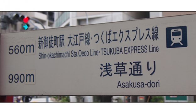
What do you think of this typesetting?
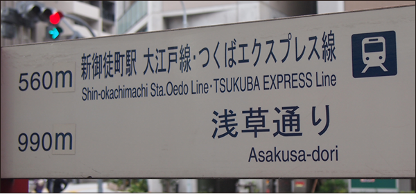
When trying to cram text into a limited space, it often ends up like this. There is plenty of room for improvement in the layout of this sign. Where and how should it be fixed?
Table of Contents
>>Translation Services by Human Science Co., Ltd.
>>Related Materials: Post-edit Quality Check Sheet Download
Negative Points

Improvement Plan
Avoid long bodies as much as possible
"Nagatai" refers to the act of narrowing the width of characters. Font design is a collection of skilled craftsmanship, so distorting it would ruin it. The more the balance of line thickness is disrupted, the lower the visibility becomes, and it also gives off a sloppy and rushed appearance. It is out of the question to think that "Nagatai" is a quick and easy way to fit text into a limited space. Let's avoid distorting characters as much as possible.
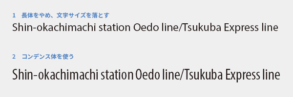
First, let's try to stop using long bodies. If left as is, it will naturally overflow, so you need to reduce the font size enough to fit in the space, but don't you think it has become much easier to read (1)? As an alternative, you can use condensed fonts (2). If the width of the characters is designed to be narrow from the beginning, it will not significantly affect the visibility.
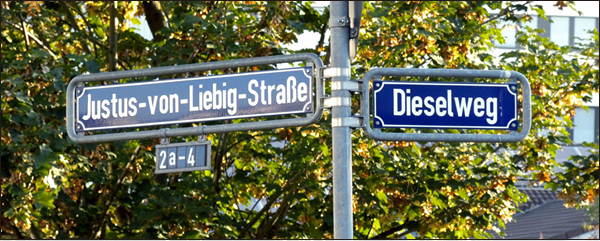
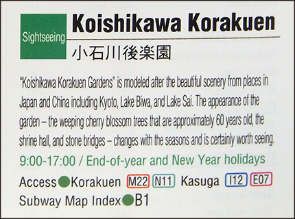
Photo: http://t-director.exblog.jp/24601588/
The fundamental solution is to increase the size of the sign. Instead of changing the text, the sign itself should be deformed to prioritize visibility. The photo above is an example from Germany, but it does not cram long bodies into a board of a certain size. The size of the sign is changed according to the amount of text.
Volume increase is inevitable in translation.
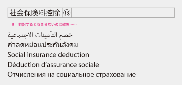
In translation from Japanese to English or from English to multiple languages, the amount of text often increases. To ensure a readable layout in the translated version, it is important to leave enough space in the source language version. Be careful when dealing with captions and tables, as idiomatic phrases may not fit in narrow spaces. Once translated, they may not fit at all.
Hmm... (speechless). It seems like they were only focused on fitting the translation into the frame, without considering readability. When it's this extreme, there's not much that can be improved through typesetting. The only solution is to narrow down the necessary information and shorten the sentences.
>>Translation Services by Human Science Co., Ltd.
>>Related Materials: Post-edit Quality Check Sheet Download
Main Reference Materials
Kobayashi Akira "Things I feel about public signs (1) Vertical lines should be thicker than horizontal lines, which is the basic principle of Western design" Eye of Type Director (https://t-director.exblog.jp/24599522/)
Kobayashi Akira "Things I feel about public signs (2) Delivering information as it is" Eye of Type Director (https://t-director.exblog.jp/24601588/)
Mugikura Seiko "Beautiful books in Europe and the typesetting situation as told by a typographer living in Germany" TypeTalks 35th edition (Seminar), 2016
Author Information
-
ISHII GentaMulti-lingual Translation Group
DTP Operator- ・In my previous job, I was in charge of DTP for Asian languages such as Arabic, Thai, and Chinese. I was involved in creating product catalogs and instruction manuals.
- ・Currently, I have expanded my language expertise to cover all European languages and am responsible for not only DTP but also multilingual localization for e-learning.
>>Related Download Materials: 9 Examples of Machine Translation Errors and Post-Editing Checklist